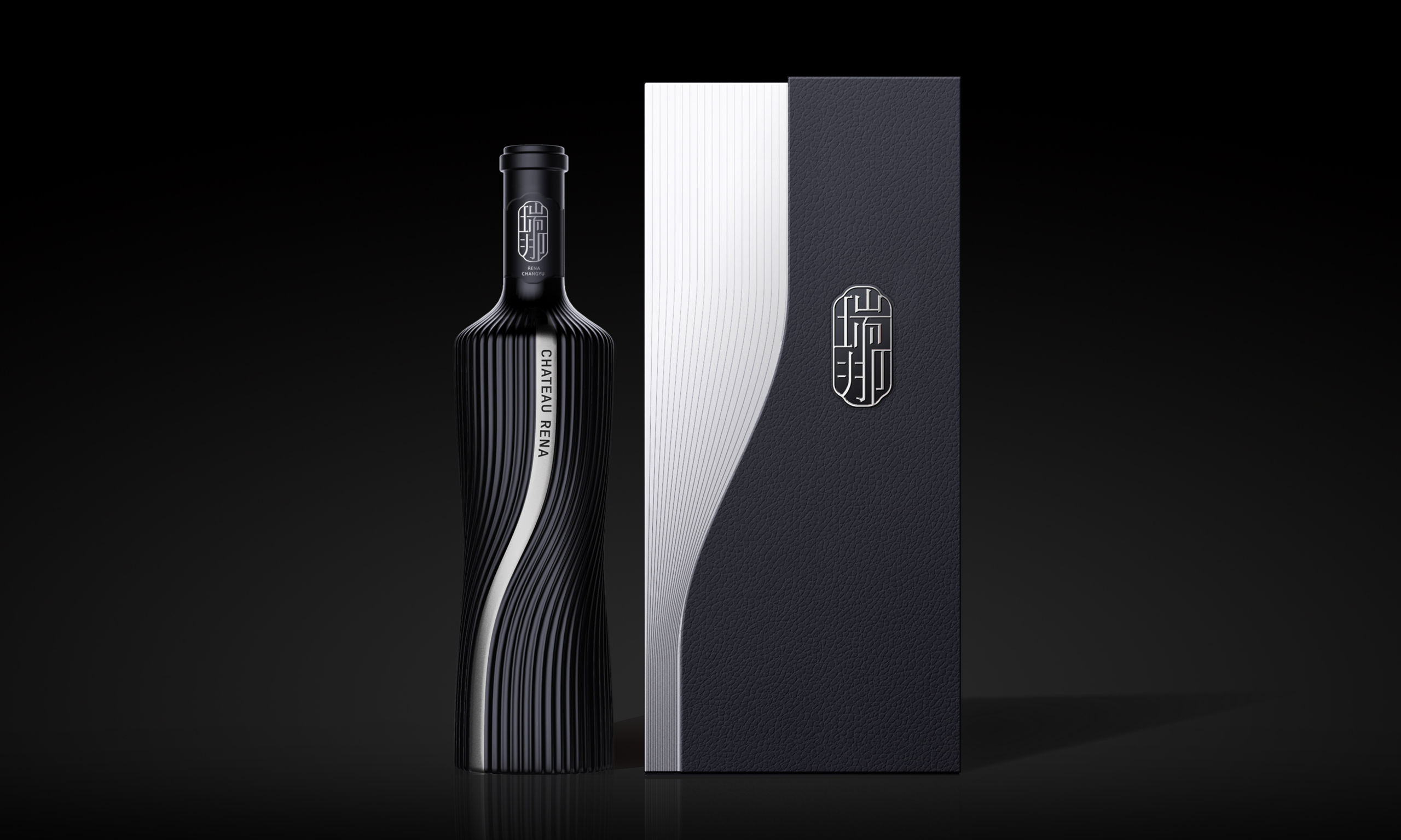
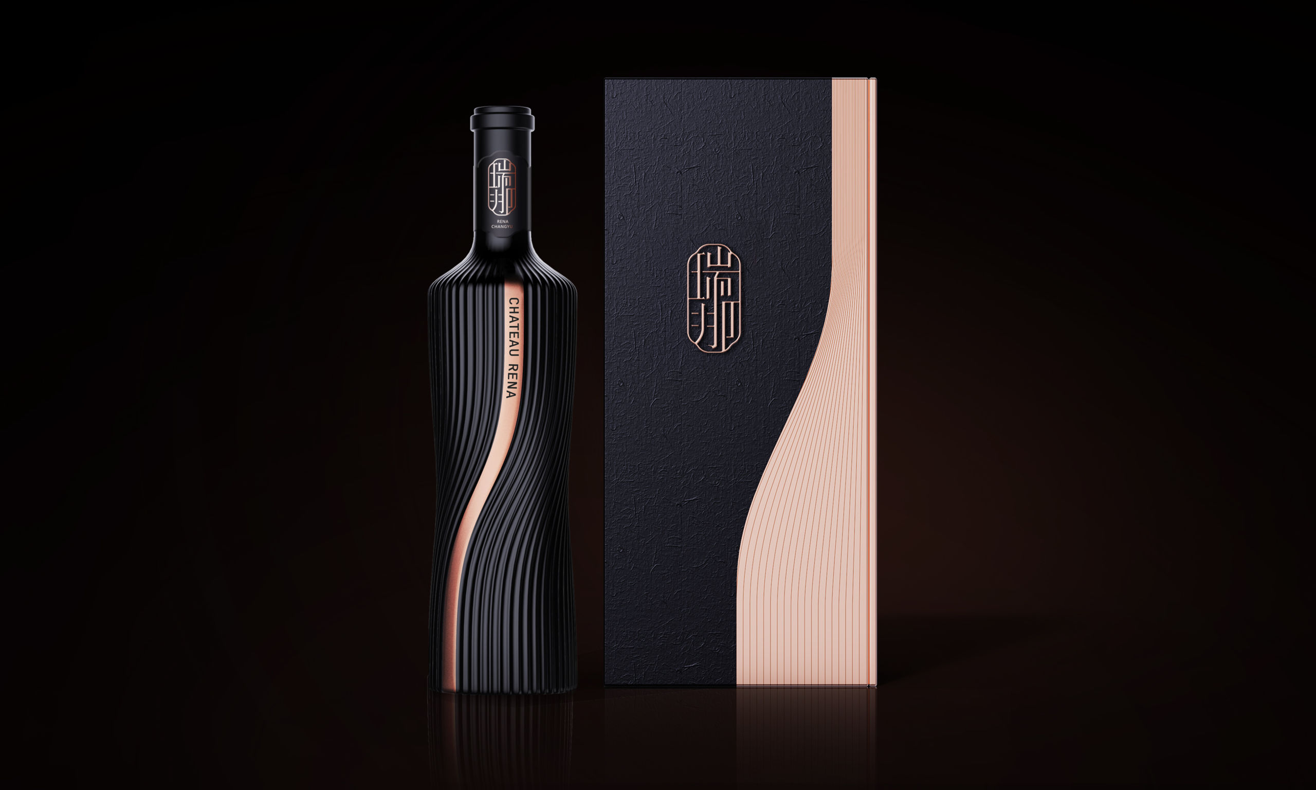
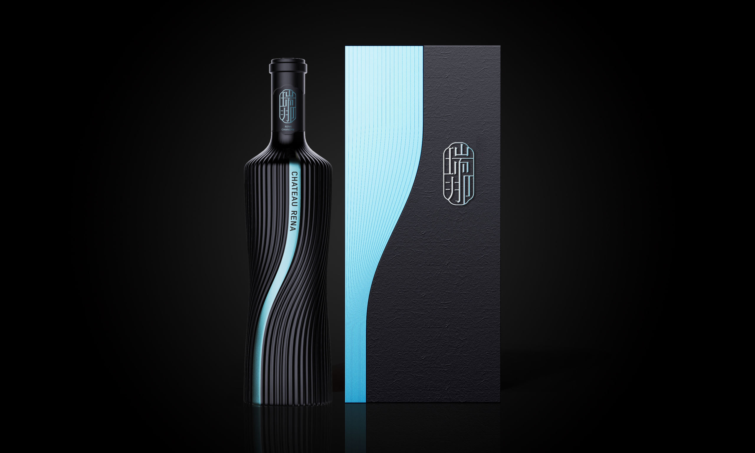
CHANGYU RENA
Wine bottle
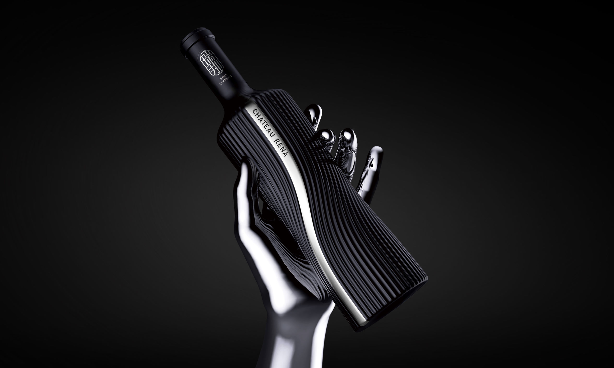
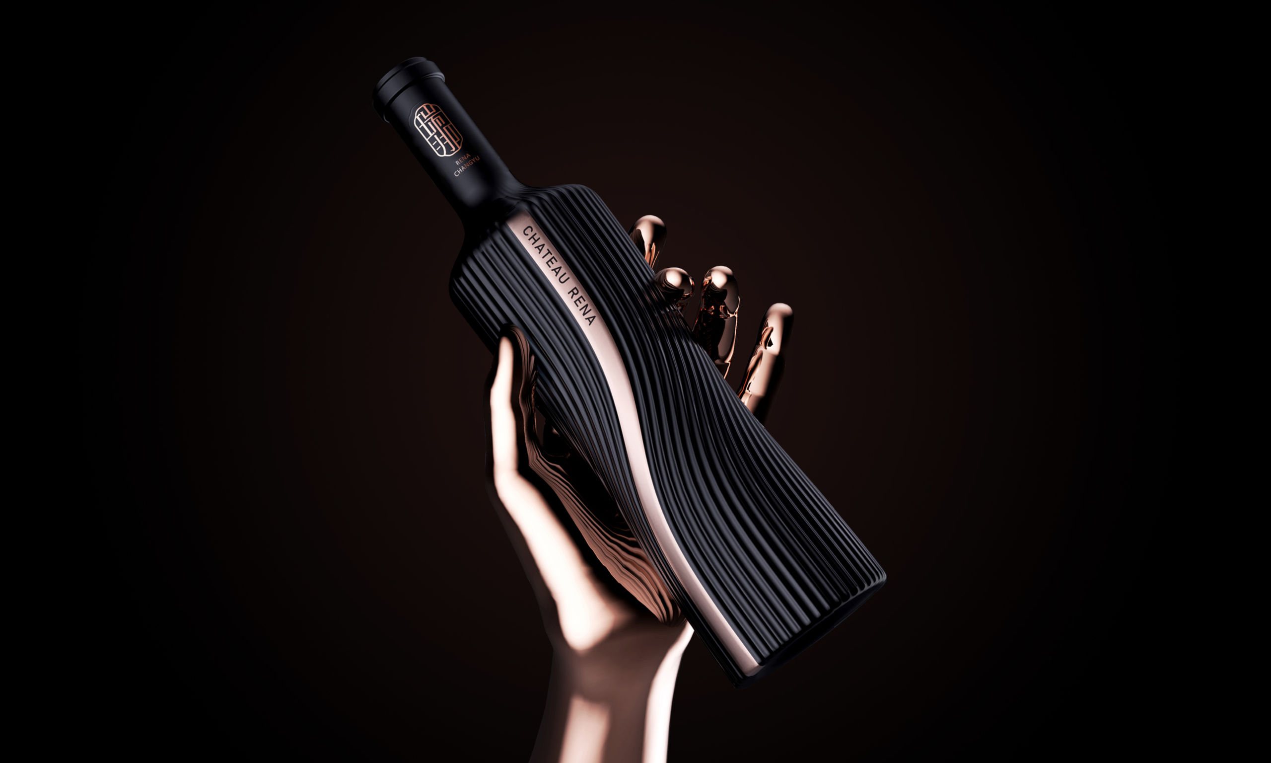
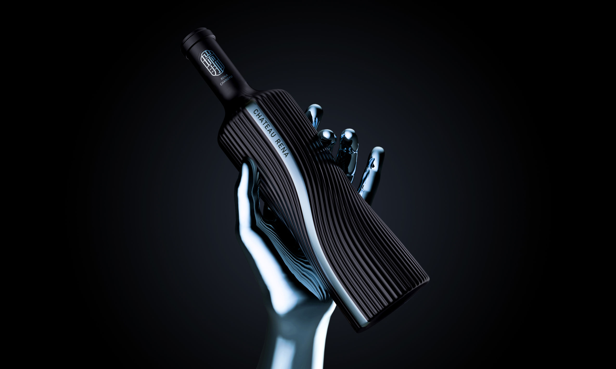
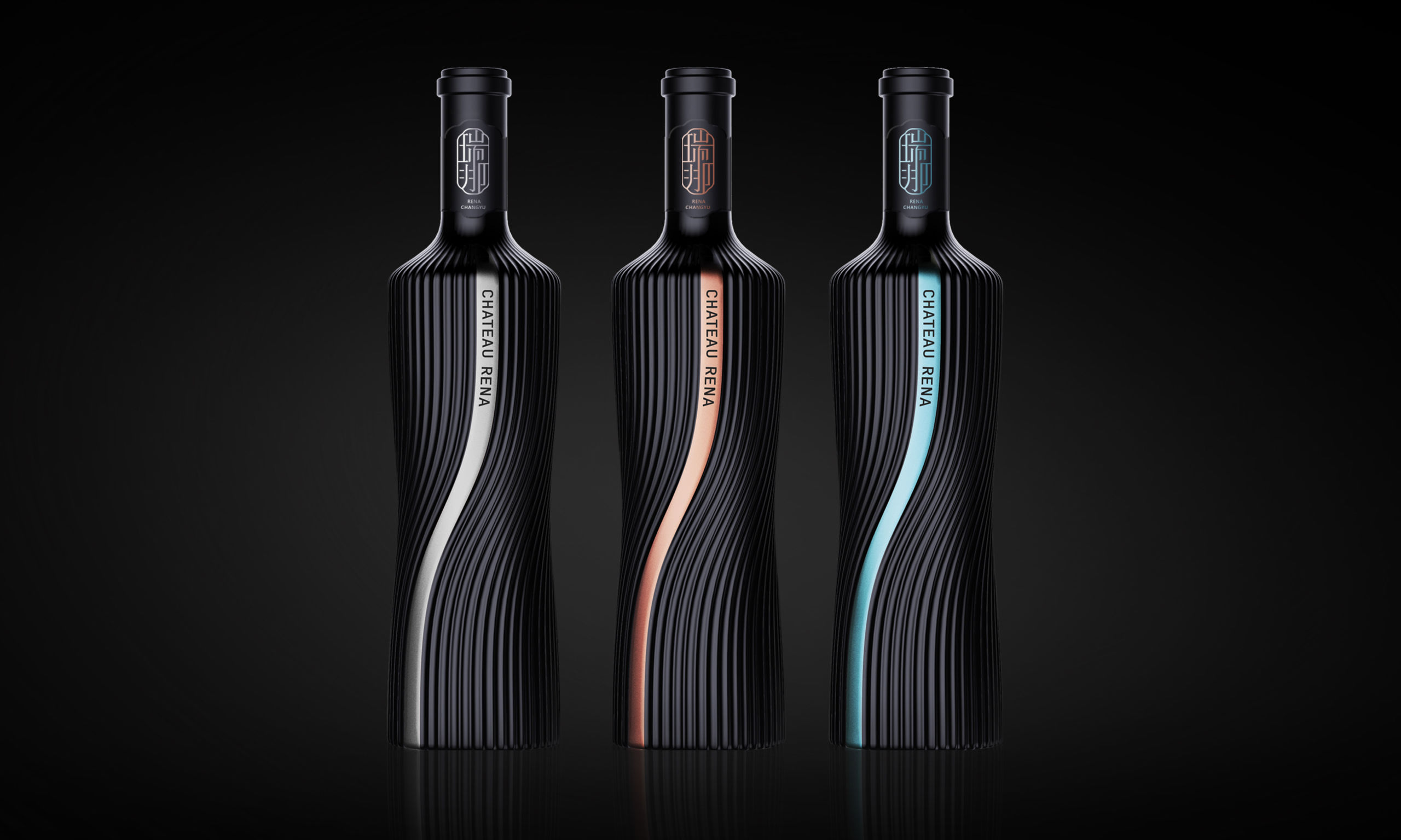
Wine bottles from across the world are very similar and lack cultural identity. That makes it difficult for consumers to choose a product. The goal of the Changyu Rena design is to be recognizable. The language is concise and modern. In terms of aesthetics, the bottle breaks with tradition by eliminating the "castle label style" and excessively decorative elements. The design relies on unique brand symbols to raise consumer brand awareness and uses cultural aesthetics to appeal to consumers. The bottle's vibrant curves highlight the brand's personality and quality and embody the concept of "blending," an important aspect as the brand's selling point is the production of "a blend of 20 oak barrels for a more balanced wine."
 点评此图
点评此图
 点评此图
点评此图
 点评此图
点评此图
 点评此图
点评此图
 点评此图
点评此图
 点评此图
点评此图
 点评此图
点评此图
Client / Manufacturer
Shenzhen Oracle Creative Design Co., Ltd.
Designer
Shenzhen Oracle Creative Design Co., Ltd.
查看更多信息
 点评此图
点评此图

14赞 0评论 1078人气

7赞 0评论 724人气

7赞 0评论 590人气

6赞 0评论 641人气
 关注
点赞
收藏
关闭弹幕
留言
关注
点赞
收藏
关闭弹幕
留言
确认要删除该条评论吗?
小小心意,大大鼓励
最高赞赏200元
使用支付宝扫描二维码完成支付
使用微信扫描二维码完成支付
当前余额:¥0.00
支付操作会向你普象账户的注册手机号发送验证码
请注意查收

扫一扫添加
普象商务
扫一扫添加
客服微信

扫一扫下载
手机APP

请关注公众号iamdesign或扫码关注
 沪公网安备 31011502009179号
沪ICP备13011487号-2 上海普象文化传播有限公司
沪公网安备 31011502009179号
沪ICP备13011487号-2 上海普象文化传播有限公司


留言板(0)