Lugano Region
0赞|0评论|291人气|0收藏|2020-01-09 08:44:18
关注
私信
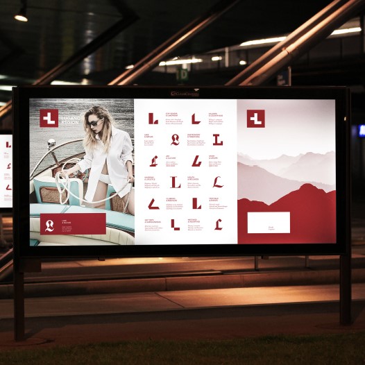
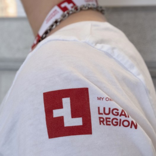
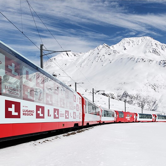
With its mix of cultures, Lugano represents a very atypical destination within Switzerland: palm trees, olive oil, Mediterranean weather and cuisine can all be found in a safe, quiet and efficient Swiss environment. The brand essence that emerged from this context is "differently Swiss" which has been translated visually in an alteration of the Swiss flag to form the letter "L" of Lugano. A graphic system that aims at displaying the variety of the regional offer has been conceived by designing for each category a specific font in order to give each time a different connotation to the letter “L” of Lugano.
 点评此图
点评此图
 点评此图
点评此图
 点评此图
点评此图
Country
Switzerland
Year
2019
Client
Ente Turistico del Luganese
Affiliation
Caselli Strategic Design
Designer
FabioCaselli
小小心意,大大鼓励
本作品版权归 K-DESIGN AWARD 所有,禁止匿名转载及个人使用,任何商业用途均需联系原作者。
举报
1赞 0评论 2008人气

3赞 0评论 1474人气
2赞 5评论 1626人气

2赞 0评论 1134人气
 关注
点赞
收藏
关闭弹幕
留言
关注
点赞
收藏
关闭弹幕
留言
确认要删除该条评论吗?
小小心意,大大鼓励
最高赞赏200元
使用支付宝扫描二维码完成支付
使用微信扫描二维码完成支付
当前余额:¥0.00
支付操作会向你普象账户的注册手机号发送验证码
请注意查收

扫一扫添加
普象商务
扫一扫添加
客服微信

扫一扫下载
手机APP

请关注公众号iamdesign或扫码关注
 沪公网安备 31011502009179号
沪ICP备13011487号-2 上海普象文化传播有限公司
沪公网安备 31011502009179号
沪ICP备13011487号-2 上海普象文化传播有限公司
留言板(0)