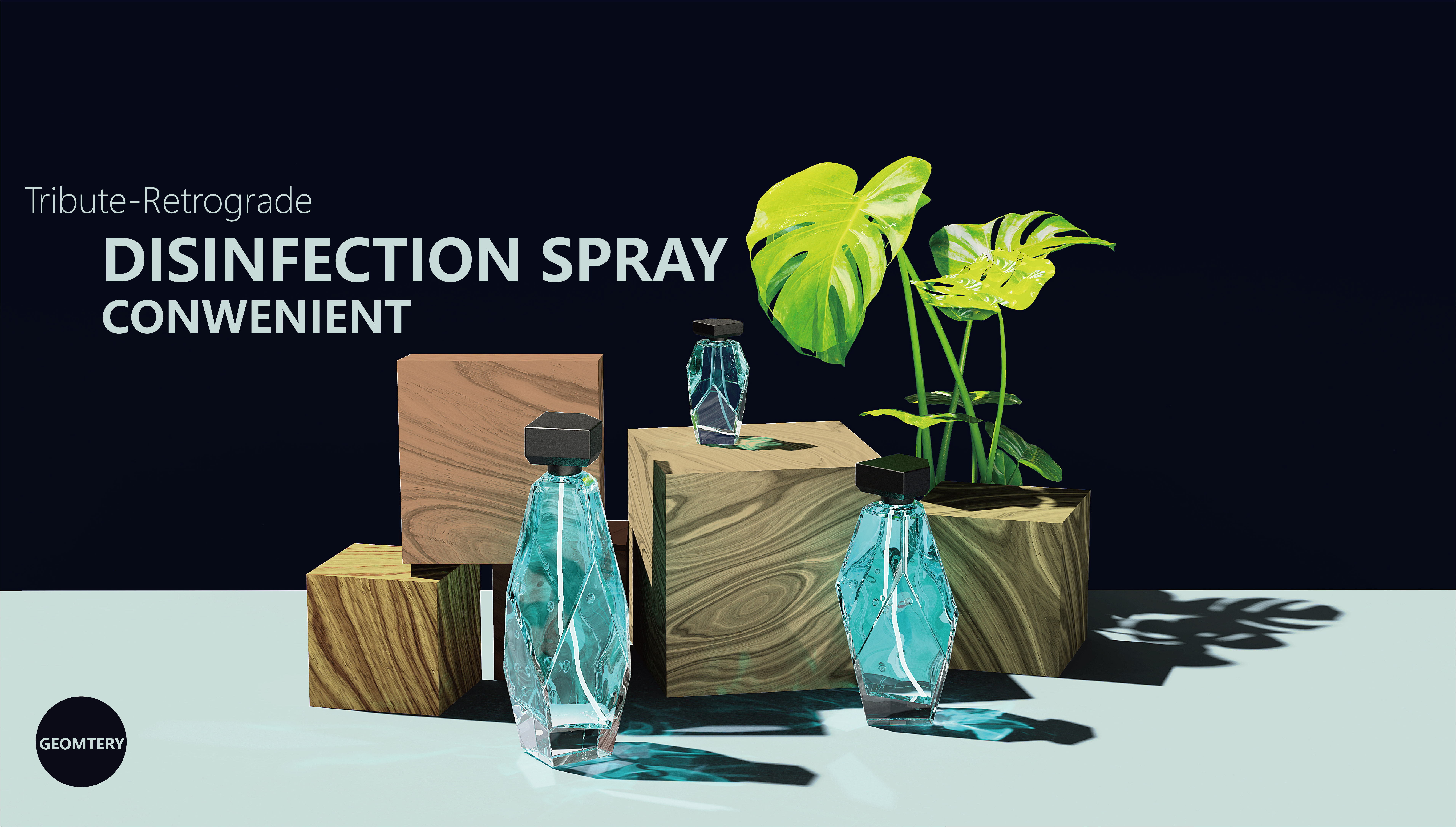
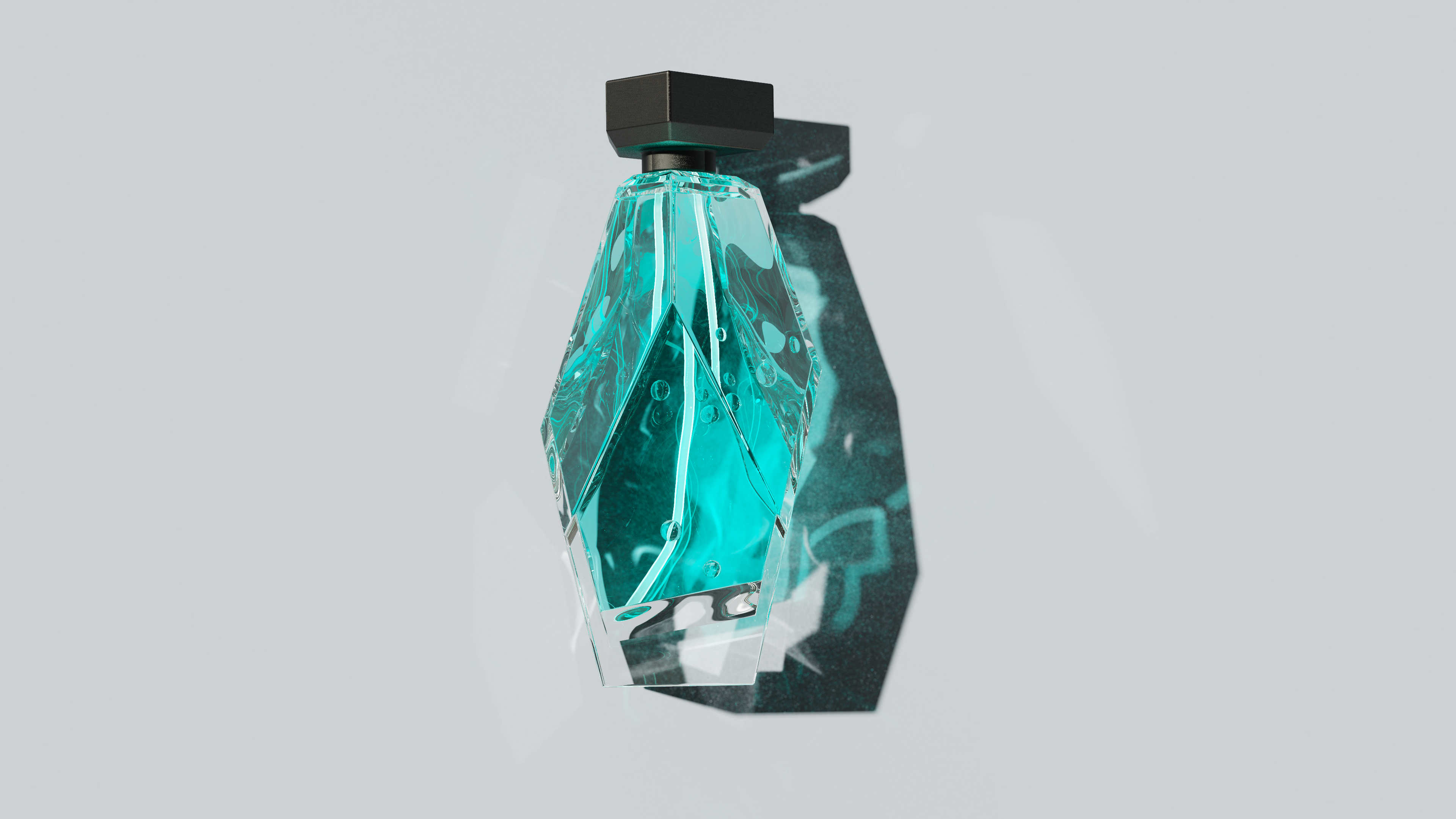
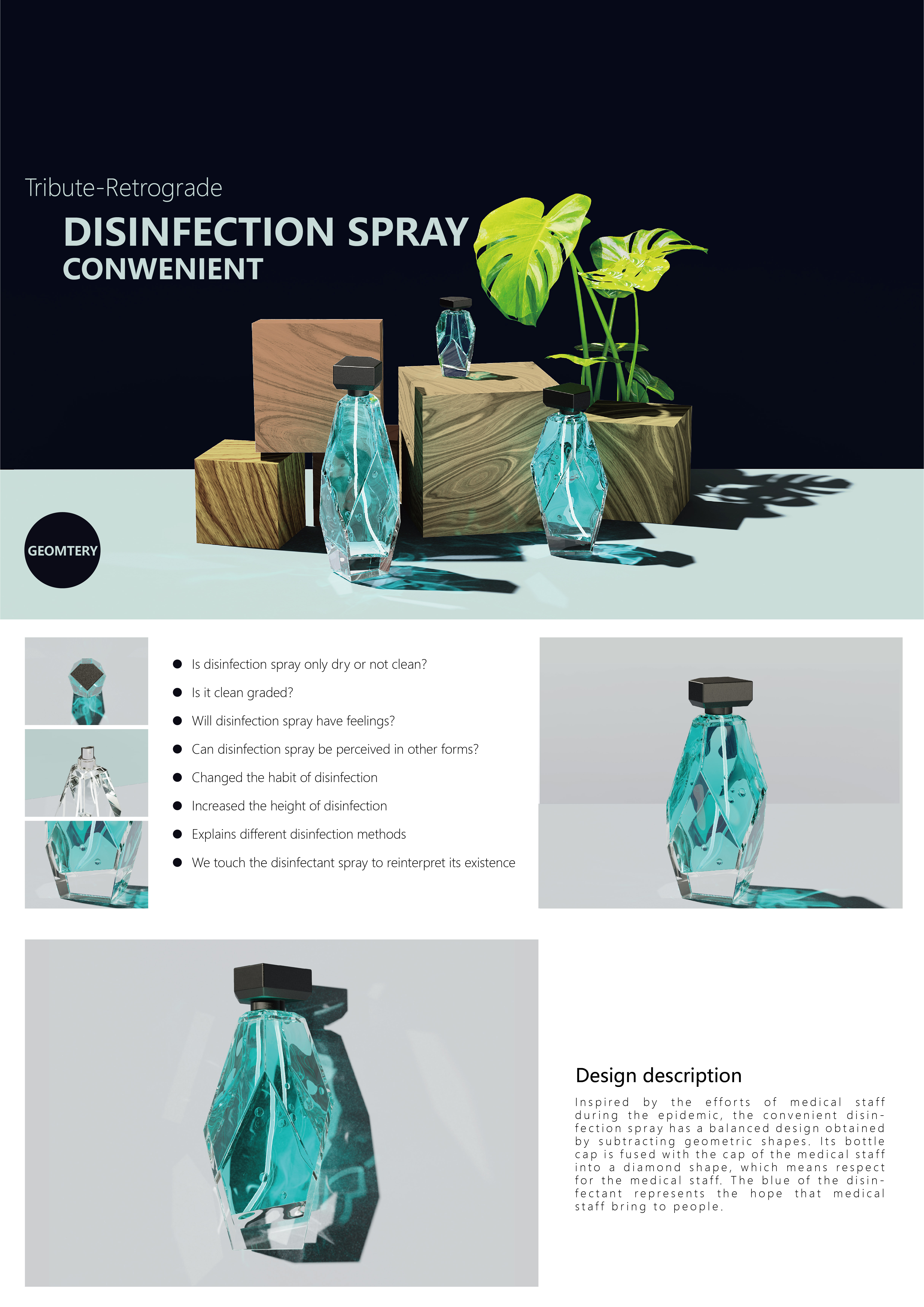
灵感来源于疫情下,医护人员的付出,便捷消毒喷雾将几何形体做减法得到的平衡设计。它的瓶盖融合医护人员的帽儿融合为钻石形状,寓意着对医护人员的尊敬。消毒液的蓝色代表医护人员给人们带来的希望。 便捷消毒喷雾,可用于以便捷简单的方式以把自己和他人的安全最大化,少量多次使用。在设计便捷消毒喷雾外观时,重点是提出一种简单但易于携带的设计。这种外观不仅轻松融入许多人的化妆包里,还可以丰富它们。 Design desc-ription: Inspired by the efforts of medical staff under the epidemic situation, the convenient disinfection spray has a balanced design obtained by subtracting geometric shapes. Its bottle cap is fused with the cap of the medical staff into a diamond shape, which means respect for the medical staff. The blue of the disinfectant represents the hope that medical staff bring to people. Convenient disinfection spray can be used in a convenient and simple way to maximize the safety of yourself and others, using small amounts and multiple times.When redesigning the appearance of the convenient disinfection spray, the focus is to propose a simple but easy to carry design. This look not only fits easily into many people's cosmetic bags, but also enriches them.
 点评此图
点评此图
 点评此图
点评此图
 点评此图
点评此图
 点评此图
点评此图
 点评此图
点评此图
小小心意,大大鼓励
本作品版权归 橘發 所有,禁止匿名转载及个人使用,任何商业用途均需联系原作者。
举报 关注
点赞
收藏
关闭弹幕
留言
关注
点赞
收藏
关闭弹幕
留言
确认要删除该条评论吗?
小小心意,大大鼓励
最高赞赏200元
使用支付宝扫描二维码完成支付
使用微信扫描二维码完成支付
当前余额:¥0.00
支付操作会向你普象账户的注册手机号发送验证码
请注意查收
扫一扫添加
普象商务
扫一扫添加
客服微信
扫一扫下载
手机APP

请关注公众号iamdesign或扫码关注
 沪公网安备 31011502009179号
沪ICP备13011487号-2 上海普象文化传播有限公司
沪公网安备 31011502009179号
沪ICP备13011487号-2 上海普象文化传播有限公司


我第一眼以为灵感是来之蝉~而且液体颜色也对,但是居然是护士。。。帽儿都出来
好棒哦
不错
瓶子设计吧