Sockpiens
Socks Brand Design
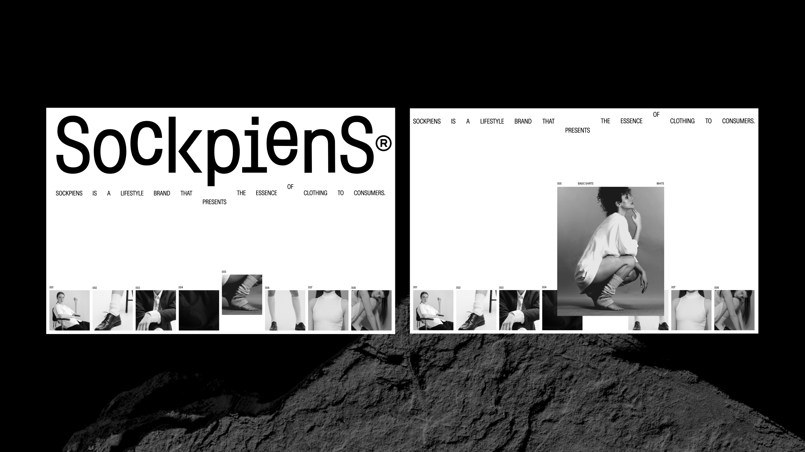
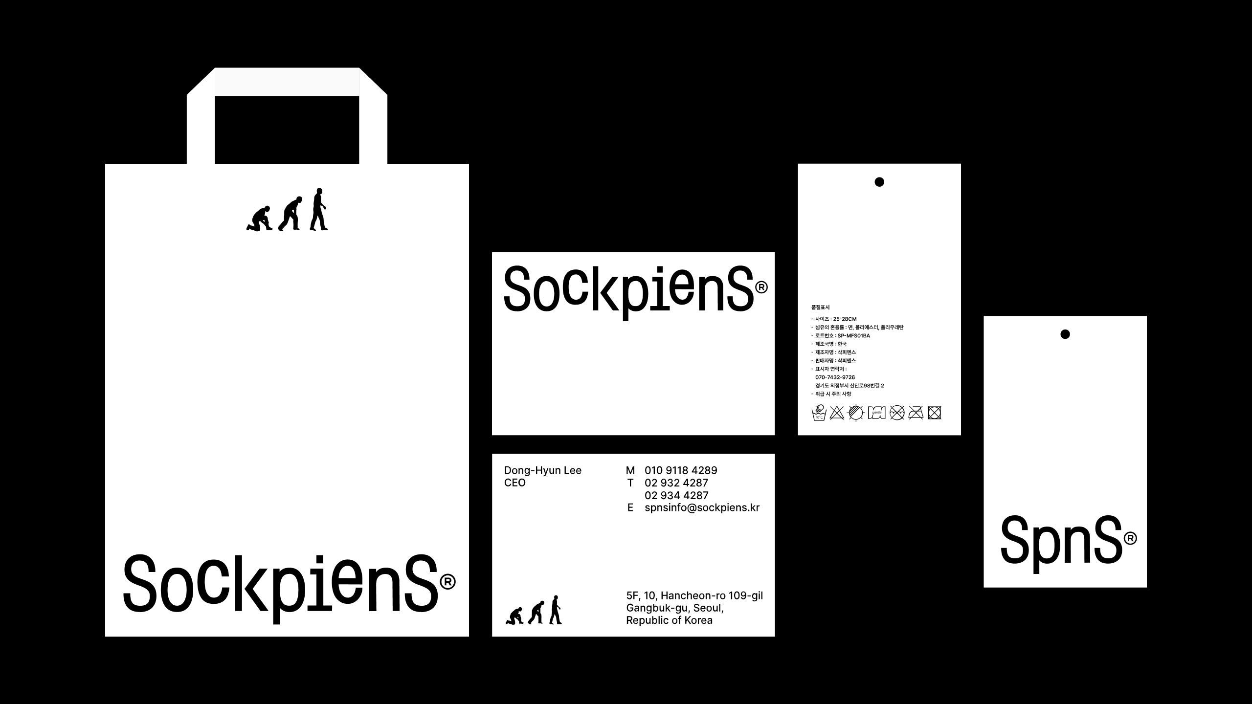
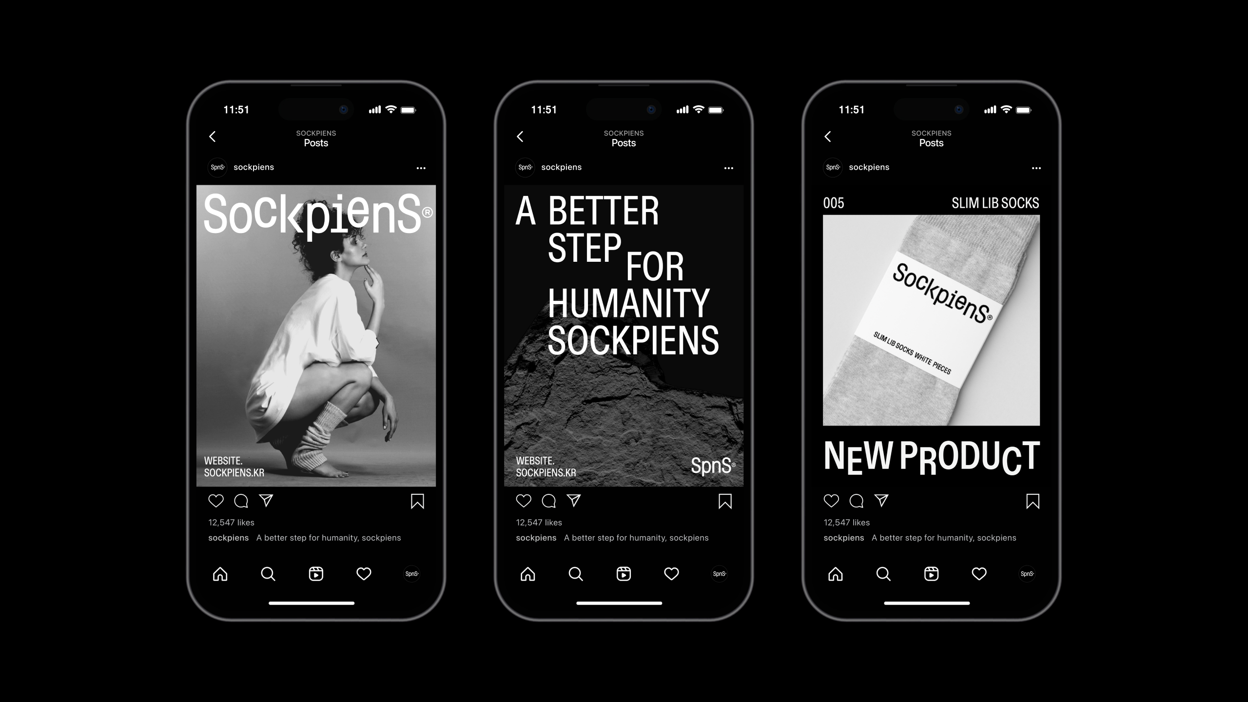
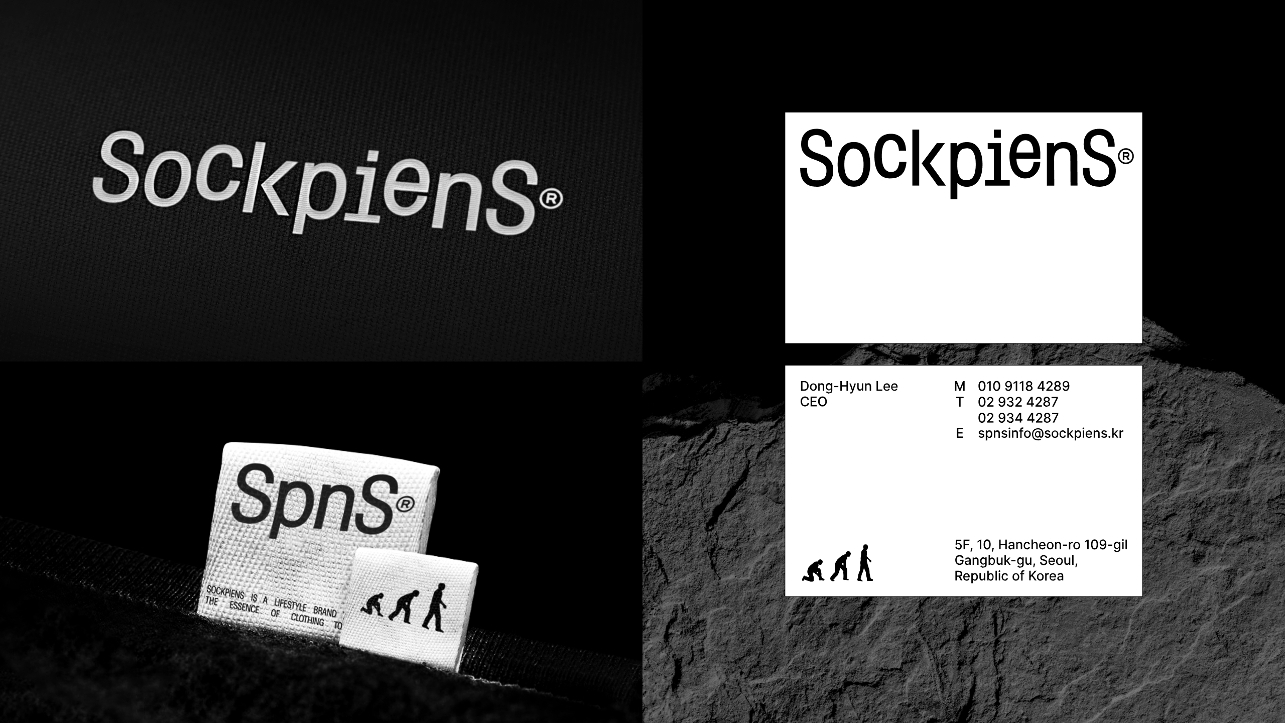
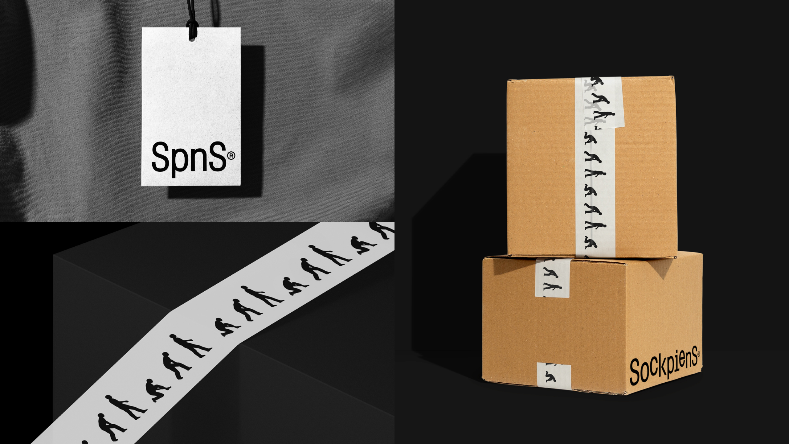
Sockpiens, a lifestyle brand, initially focused on socks, aims to expand into essential clothing. The wordmark and brand design, featuring two feet in opposite directions, symbolize a better everyday life with basic clothing. Starting from socks, it commemorates the concept of 'footsteps.' The symbol, a reinterpretation of 'Homo sapiens,' targets those who wear socks daily, adding a fun and positive touch. The design ensures brand consistency, spanning typography, imagery, and website interaction.
 点评此图
点评此图
 点评此图
点评此图
 点评此图
点评此图
 点评此图
点评此图
 点评此图
点评此图
 点评此图
点评此图
Client / Manufacturer
POPCORN & KIKI
Seoul, KR
Design
BRENDEN
Seoul, KR
Doeui Lee, Jiwoong Lee, Sung-Oh Park, Ye-Seop Lee, Jeong-in Byun
查看更多信息
 点评此图
点评此图
31赞 0评论 3495人气

12赞 0评论 2057人气
19赞 0评论 3195人气
 关注
点赞
收藏
关闭弹幕
留言
关注
点赞
收藏
关闭弹幕
留言
确认要删除该条评论吗?
小小心意,大大鼓励
最高赞赏200元
使用支付宝扫描二维码完成支付
使用微信扫描二维码完成支付
当前余额:¥0.00
支付操作会向你普象账户的注册手机号发送验证码
请注意查收
扫一扫添加
普象商务
扫一扫添加
客服微信
扫一扫下载
手机APP

请关注公众号iamdesign或扫码关注
 沪公网安备 31011502009179号
沪ICP备13011487号-2 上海普象文化传播有限公司
沪公网安备 31011502009179号
沪ICP备13011487号-2 上海普象文化传播有限公司

留言板(0)