【2020 当代好设计奖】英雄金笔“朝代美学”系列设计
15赞|1评论|1996人气|11收藏|2021-06-03 15:27:12
关注
私信
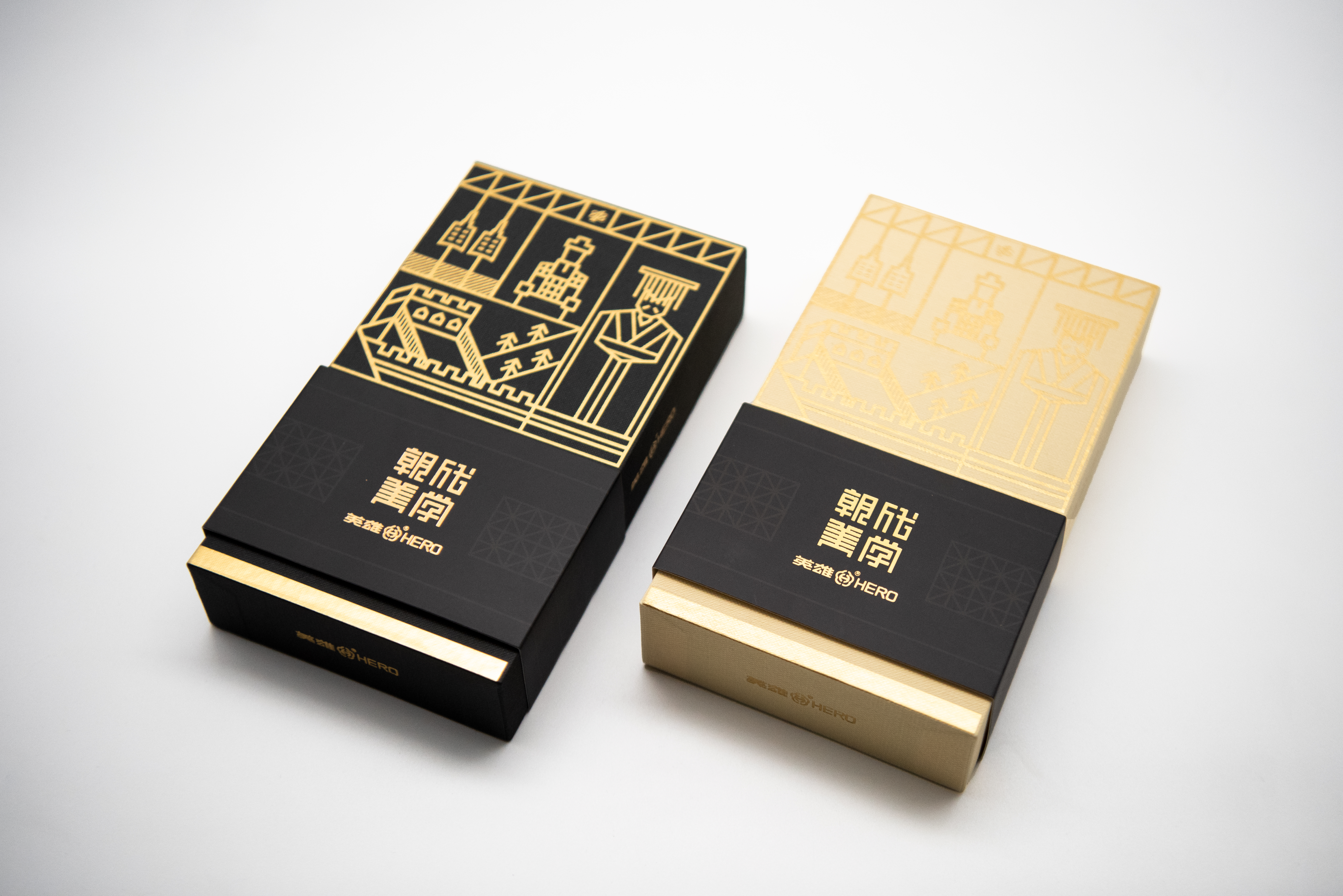
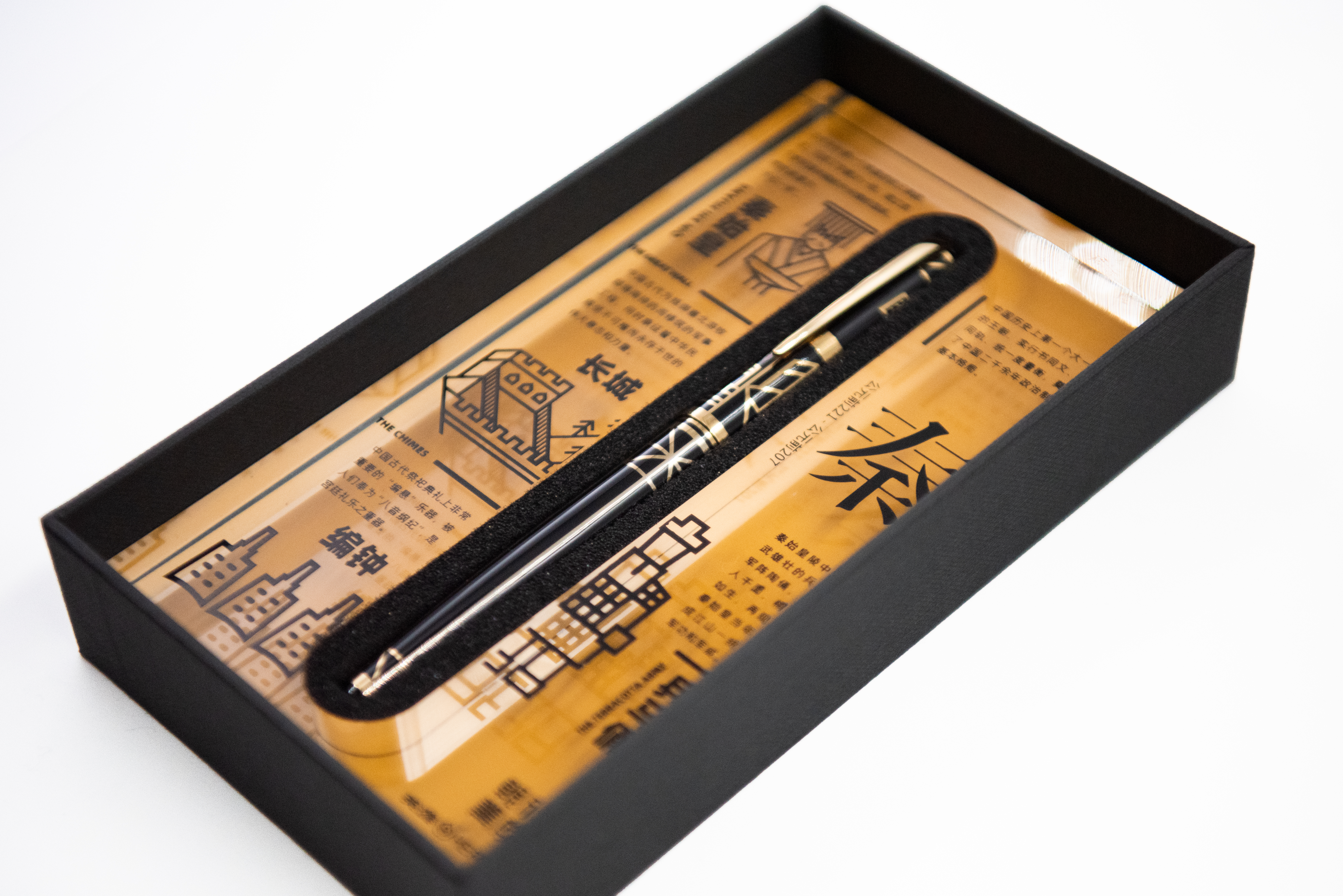
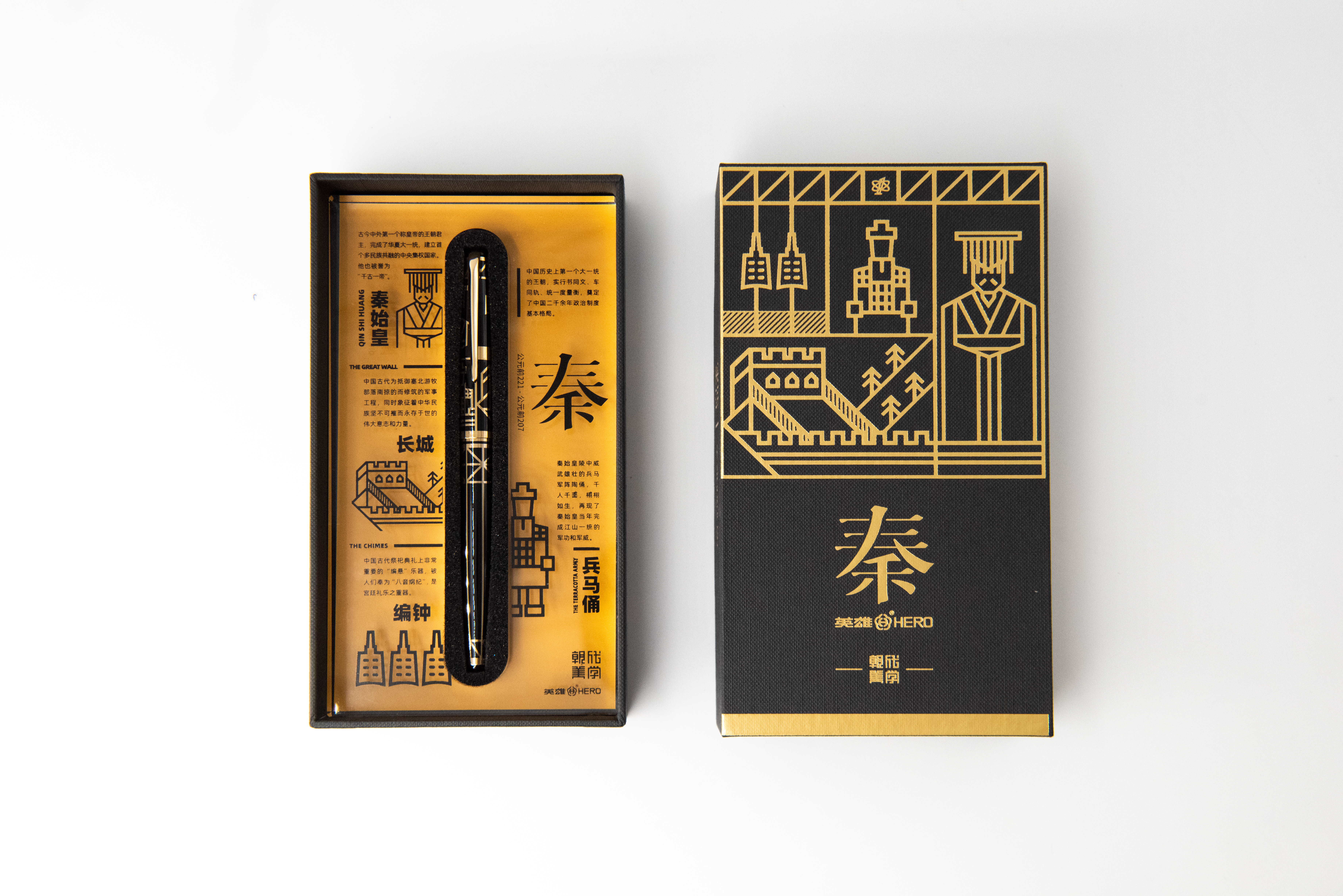
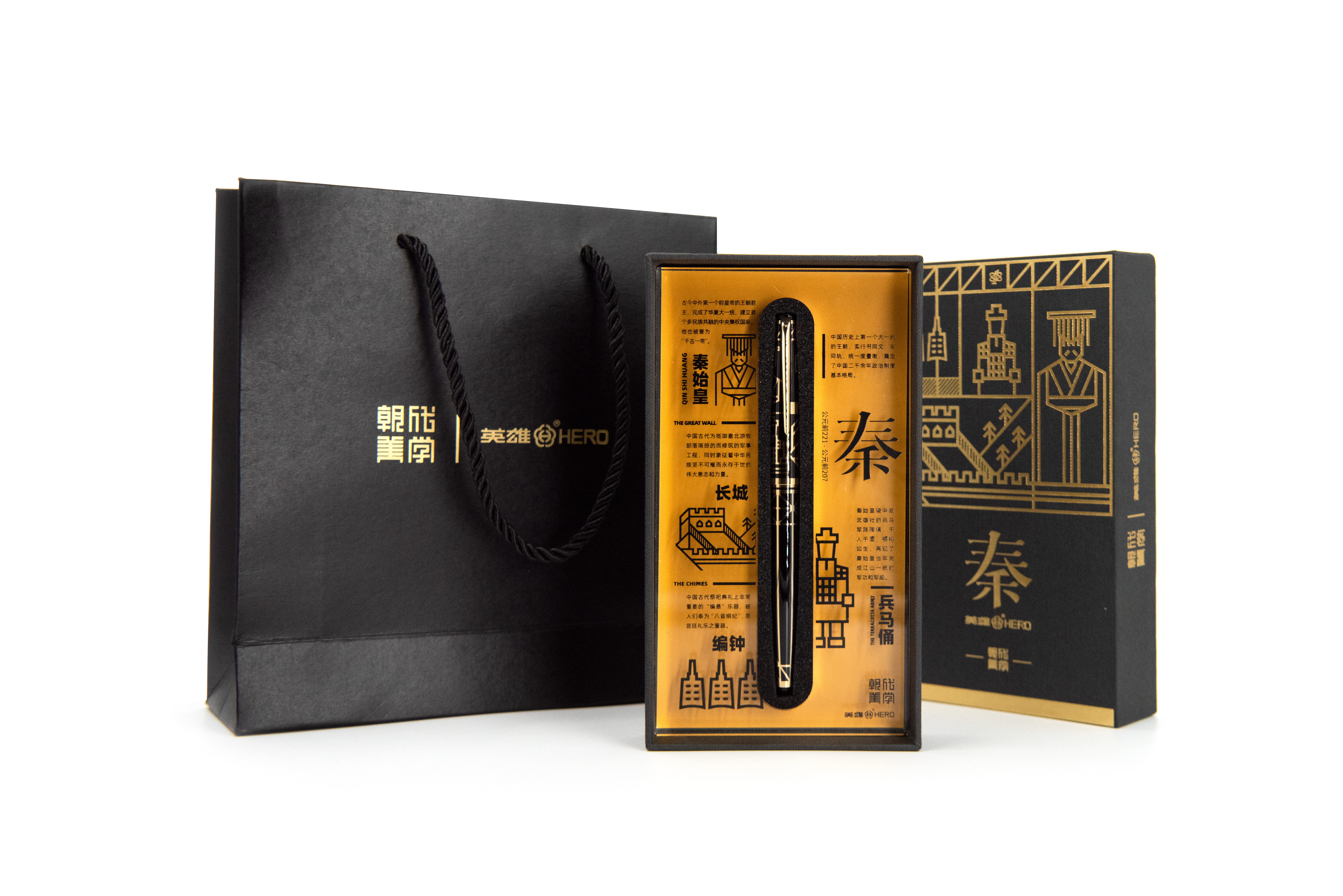
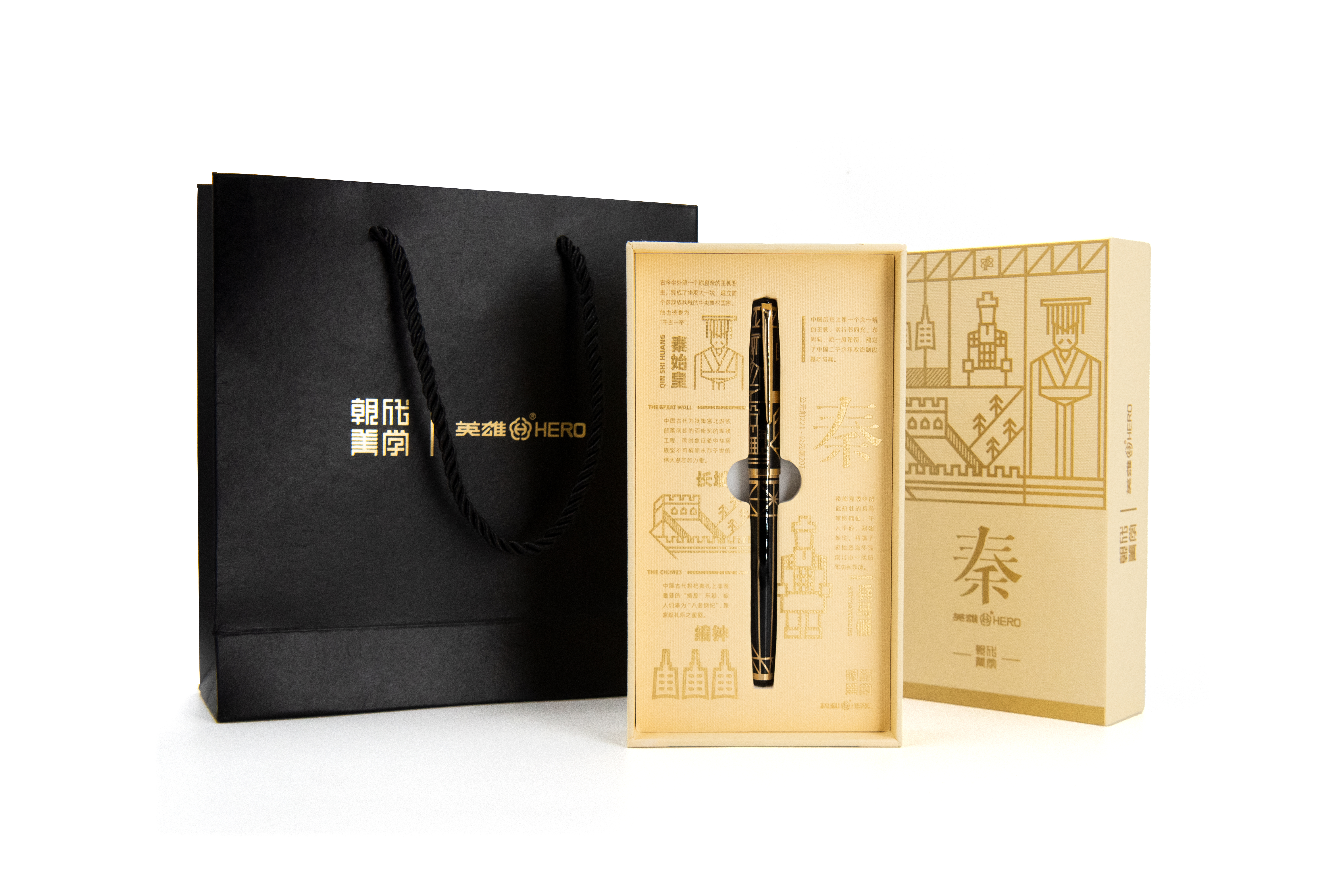
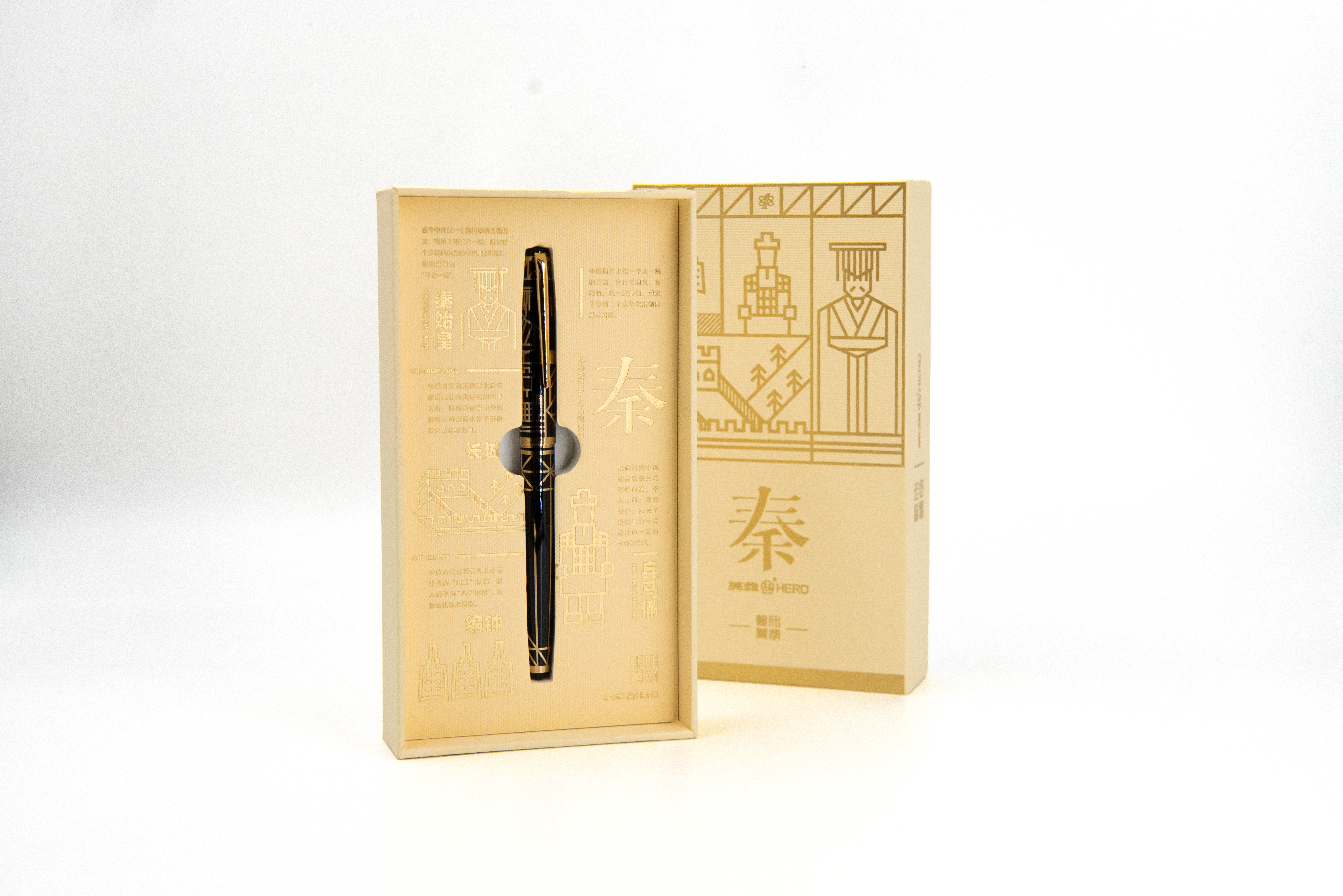
设计理念源自中国书画术语“书画同源”。深度剖析中国各朝人文、建筑、历史等元素进行符号化,开发了“英雄100号米字设计规范”先后设计了“秦汉唐宋元明清”专属图案,浓缩了中国朝代美学符号。笔尖采用14K纯金笔尖,在保证书写顺畅的前提下提升弹性触感。笔身与笔帽,采用了双色套杆镀金工艺,与高透亚克力光线折射下的文化元素相得益彰,与英雄金笔“质量第一,以人为本,赶超先进,追求卓越”的品牌文化和经营理念相呼应。
The design concept of this product is derived from a term of Chinese calligraphy and painting, “consubstantiality of Chinese painting and calligraphy”. We have conducted an in-depth anlysis of the humanities, architecture, and history of various dynasties in China, and symbolized the representative elements, thereby developing the “Design Code of Hero 100 on the Character ‘米’” , and successively designed the exclusive patterns of different dynasties, including Qin, Han, Tang, Song, Yuan, Ming, and Qing. The pen nip, made of 14 k gold, enhances the elastic touch while ensuring smooth writing. The body and cap of the pen adopt the two-color sleeve gilding process, which complements the cultural elements refracted by the light through the high-transparent acrylic, and echoes the brand culture and business philosophy of Hero Gold Pen, “Quality first, People-oriented; Surpassing the advanced, and Pursuing excellence”.
 点评此图
点评此图
 点评此图
点评此图
 点评此图
点评此图
 点评此图
点评此图
 点评此图
点评此图
 点评此图
点评此图
本作品转载于原创设计师 : 上海英雄金笔厂有限公司 Shanghai Hero Pen Factory Co., Ltd.;上海梵木品牌设计咨询有限公司 Shanghai Vamo Design Studio
举报
8赞 0评论 2252人气

15赞 0评论 3121人气

18赞 0评论 2591人气

11赞 0评论 1426人气

 关注
点赞
收藏
关闭弹幕
留言
关注
点赞
收藏
关闭弹幕
留言
确认要删除该条评论吗?
小小心意,大大鼓励
最高赞赏200元
使用支付宝扫描二维码完成支付
使用微信扫描二维码完成支付
当前余额:¥0.00
支付操作会向你普象账户的注册手机号发送验证码
请注意查收

扫一扫添加
普象商务
扫一扫添加
客服微信

扫一扫下载
手机APP

请关注公众号iamdesign或扫码关注
 沪公网安备 31011502009179号
沪ICP备13011487号-2 上海普象文化传播有限公司
沪公网安备 31011502009179号
沪ICP备13011487号-2 上海普象文化传播有限公司
看着咋更像一个烟盒呢