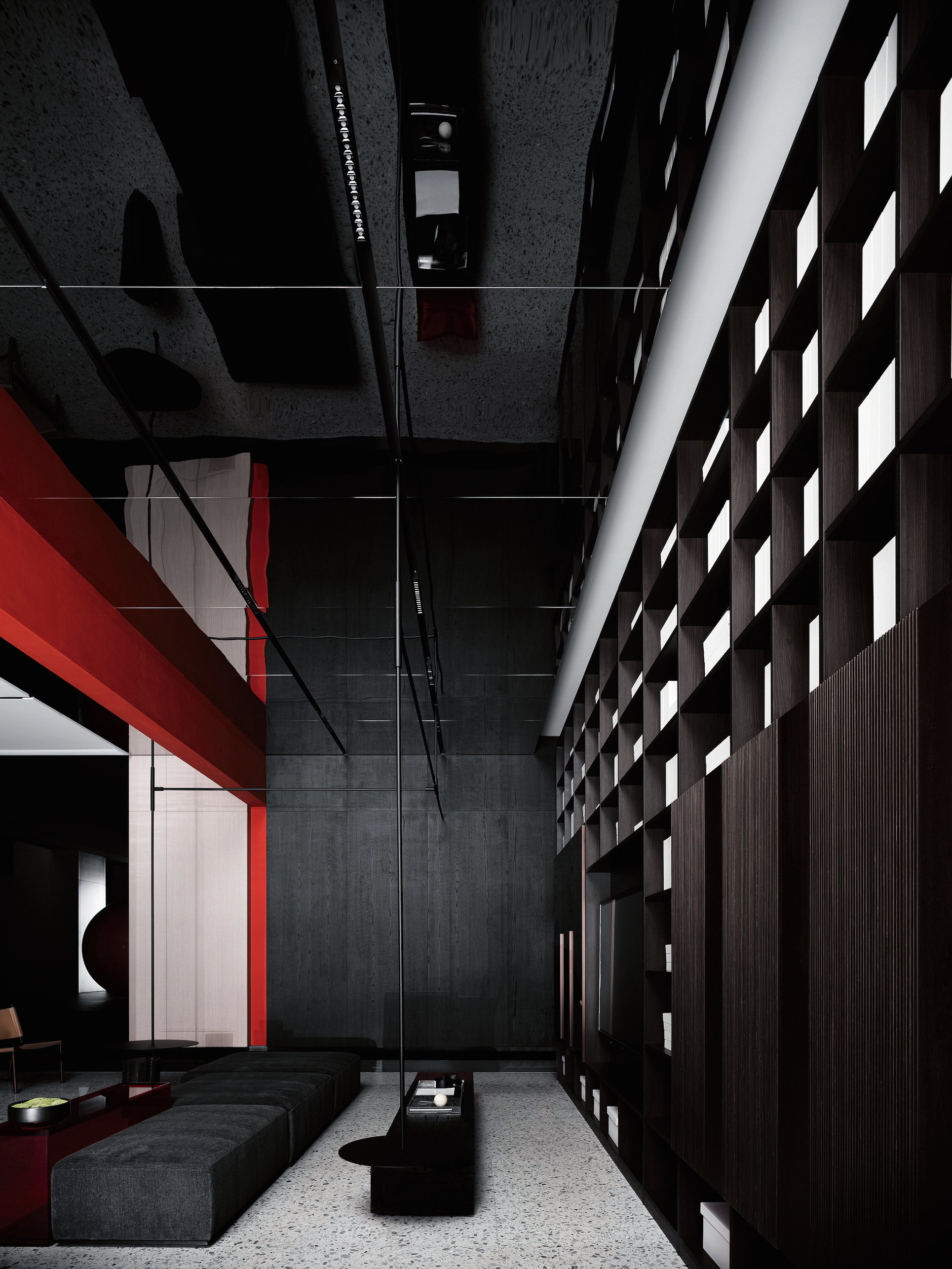
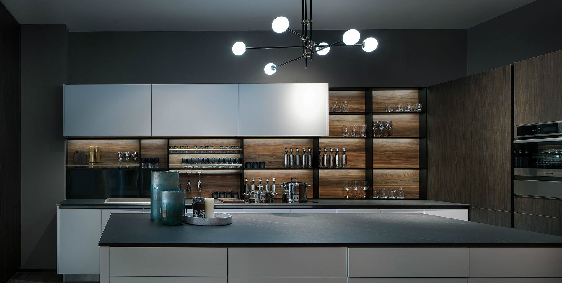
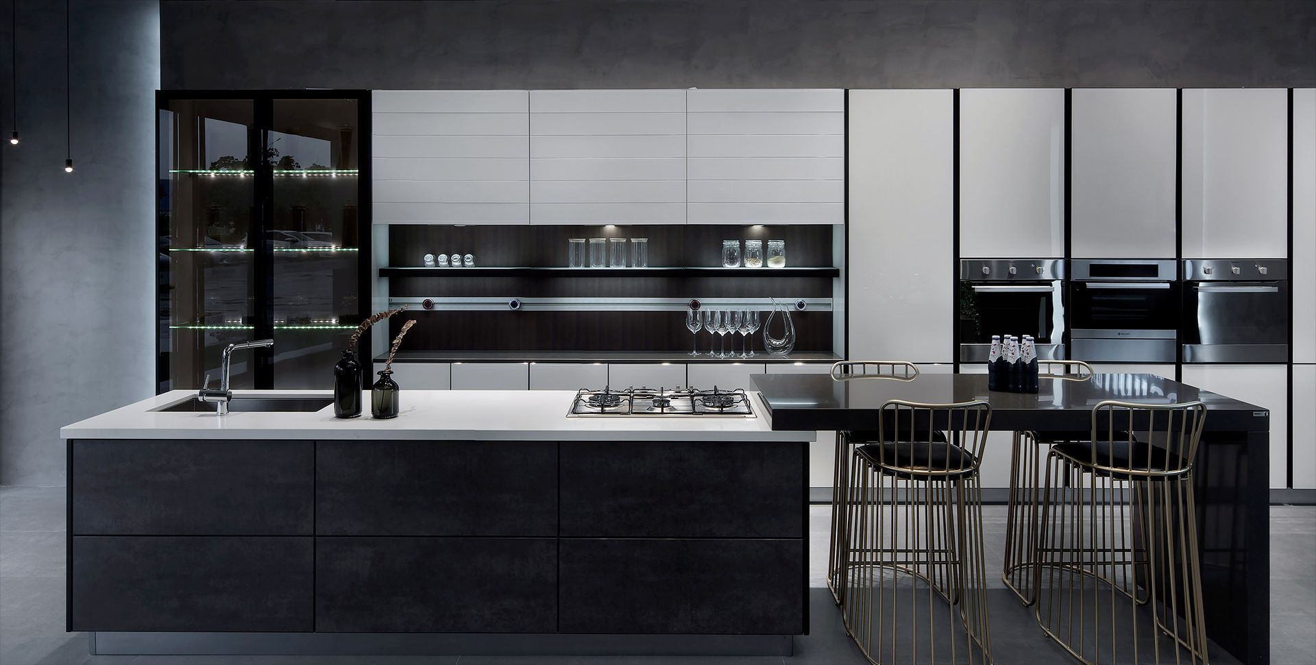
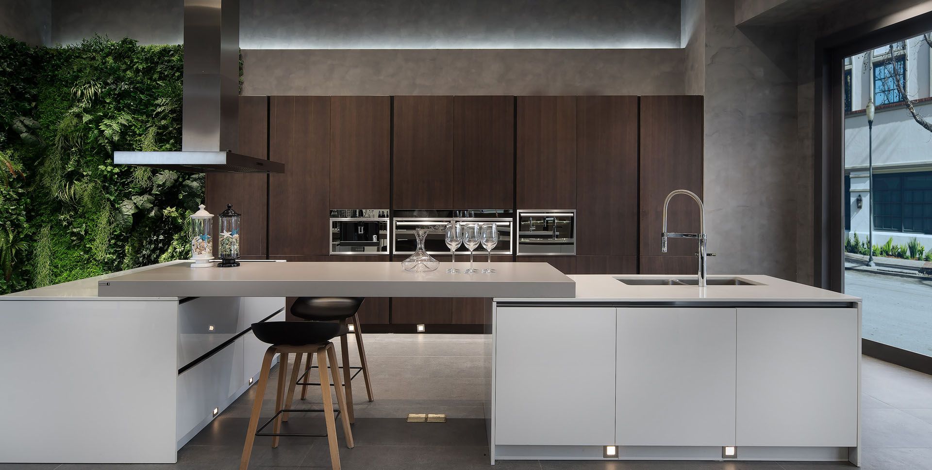
The design of this flagship store employs contrasting colours. The facade is made of geometric blocks in black and white with red accents similar to those in the company name. Red and black dominate the interior. The brand logo in the form of a freestanding red sphere is a head-turning eye-catcher. To soften the commercial nature of the site and introduce a sense of privacy, customers have several meeting areas at their disposal fitted with furniture in a range of styles.
 点评此图
点评此图
 点评此图
点评此图
 点评此图
点评此图
 点评此图
点评此图
评审团评语
The fascinating use of contrasts gives the Beimu flagship store an aesthetic appearance and a powerful aura.
参与人士
Client:
Guangdong Beimu Home Furnishing Co., Ltd., Dongguan, China
Design:
(OD.O) one design office Ltd., Huson, Dongguan, China
Shenzhen Chengyi Design Co., Ltd., Shenzhen, China
www.hk-beimu.com
www.one-design.site

11赞 1评论 1288人气

6赞 0评论 1237人气

12赞 0评论 1278人气

15赞 0评论 1251人气
 关注
点赞
收藏
关闭弹幕
留言
关注
点赞
收藏
关闭弹幕
留言
确认要删除该条评论吗?
小小心意,大大鼓励
最高赞赏200元
使用支付宝扫描二维码完成支付
使用微信扫描二维码完成支付
当前余额:¥0.00
支付操作会向你普象账户的注册手机号发送验证码
请注意查收

扫一扫添加
普象商务
扫一扫添加
客服微信

扫一扫下载
手机APP

请关注公众号iamdesign或扫码关注
 沪公网安备 31011502009179号
沪ICP备13011487号-2 上海普象文化传播有限公司
沪公网安备 31011502009179号
沪ICP备13011487号-2 上海普象文化传播有限公司
留言板(0)