Orange House
Private Stay House Branding
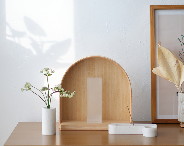
This is the branding project for the Orange House. The Orange House is a private stay located in Sokcho, designed in the shape of a large stone. The brand identity is developed by focusing on the colors, nature, and textures experienced in the space. The logotype “Orange House" and the building shape are graphic representations designed to resemble crayon-like drawings, with witty pictograms and natural brush textures functioning as another sensory aspect of the space. The Orange House's strong character communicates its value as a place where visitors can break away from their daily routines and fully relax while filling their unique senses.
 点评此图
点评此图
 点评此图
点评此图
 点评此图
点评此图
 点评此图
点评此图
 点评此图
点评此图
 点评此图
点评此图
Client / Manufacturer
Orange House
Sokcho, KR
Design
BRENDEN
Seoul, KR
查看更多信息
 点评此图
点评此图

31赞 0评论 3464人气

12赞 0评论 2044人气
19赞 0评论 3165人气
 关注
点赞
收藏
关闭弹幕
留言
关注
点赞
收藏
关闭弹幕
留言
确认要删除该条评论吗?
小小心意,大大鼓励
最高赞赏200元
使用支付宝扫描二维码完成支付
使用微信扫描二维码完成支付
当前余额:¥0.00
支付操作会向你普象账户的注册手机号发送验证码
请注意查收

扫一扫添加
普象商务
扫一扫添加
客服微信

扫一扫下载
手机APP

请关注公众号iamdesign或扫码关注
 沪公网安备 31011502009179号
沪ICP备13011487号-2 上海普象文化传播有限公司
沪公网安备 31011502009179号
沪ICP备13011487号-2 上海普象文化传播有限公司

留言板(0)