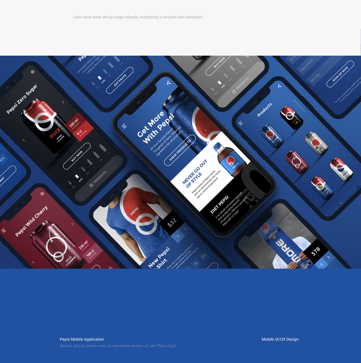
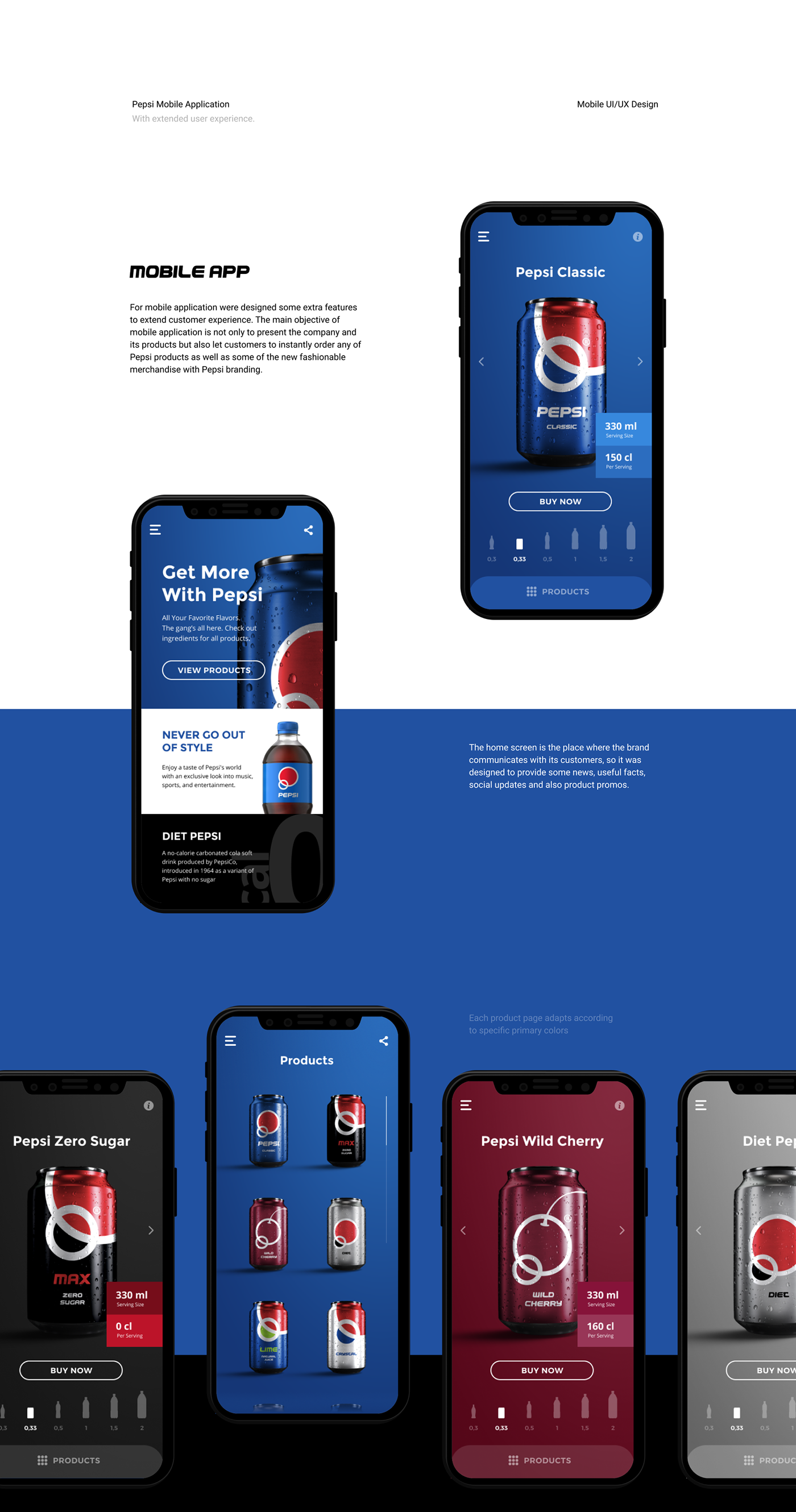
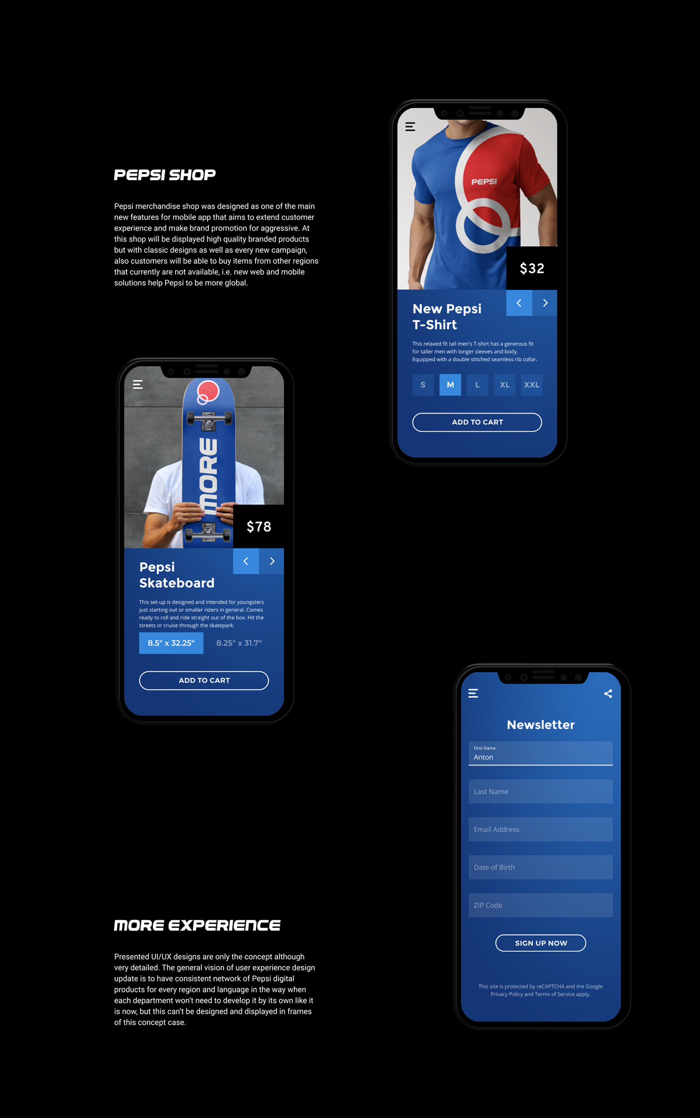
【2020 红点奖】Pepsi Brand Identity Re-Design / 品牌新标识
其他
2020红点设计概念大奖·
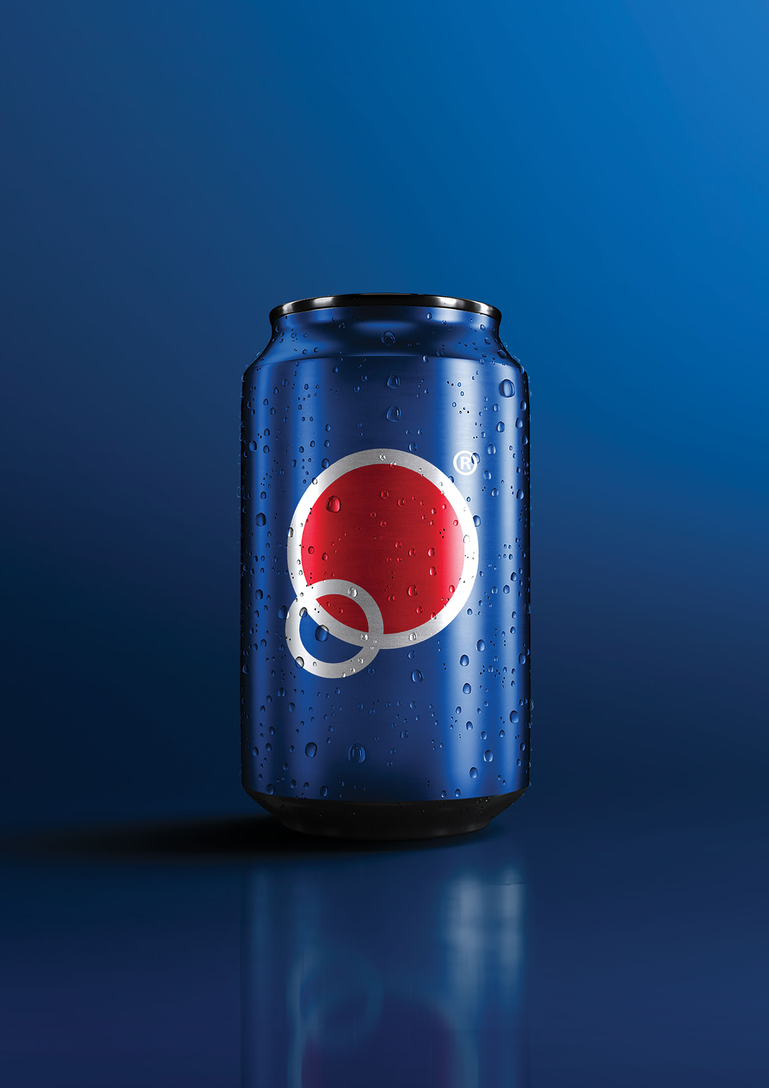
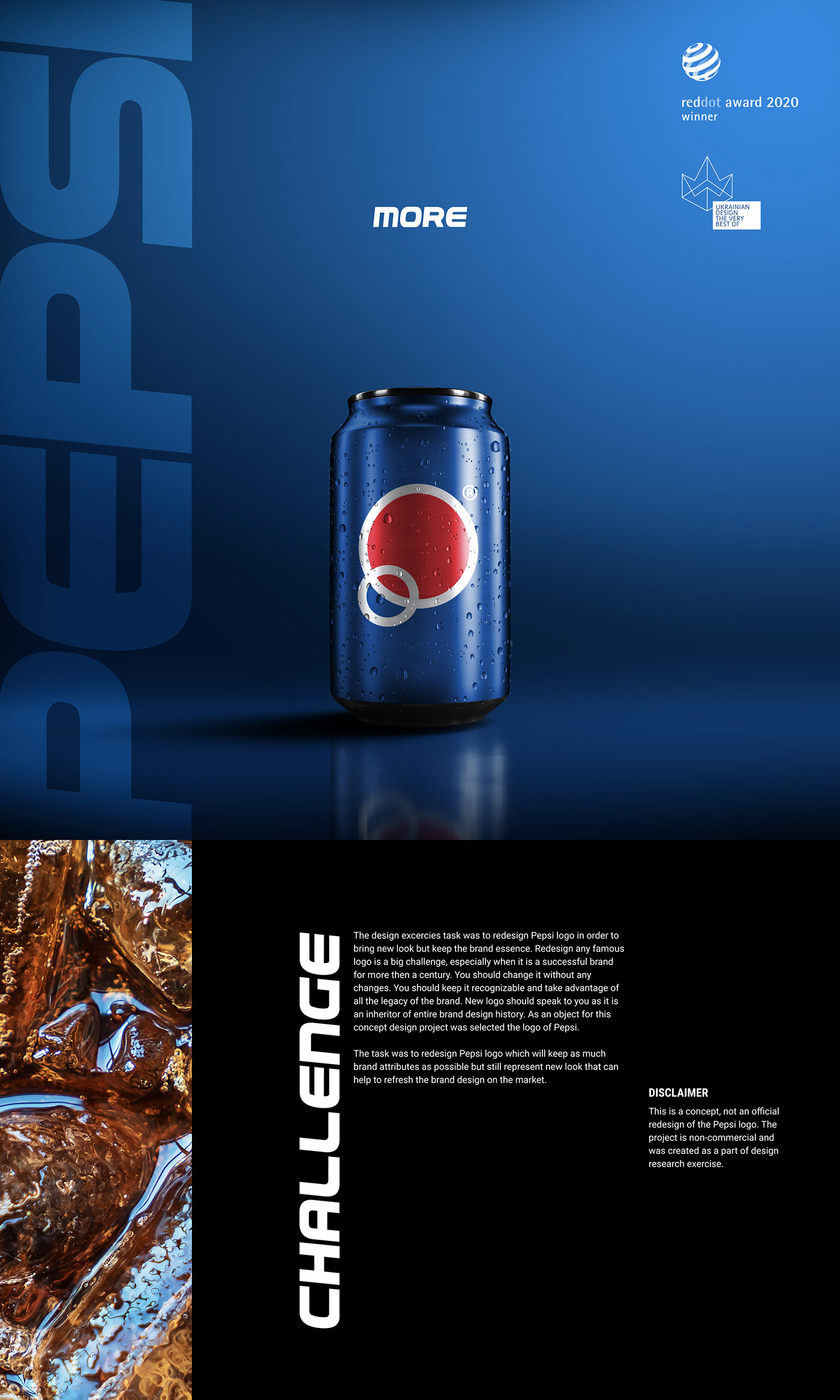
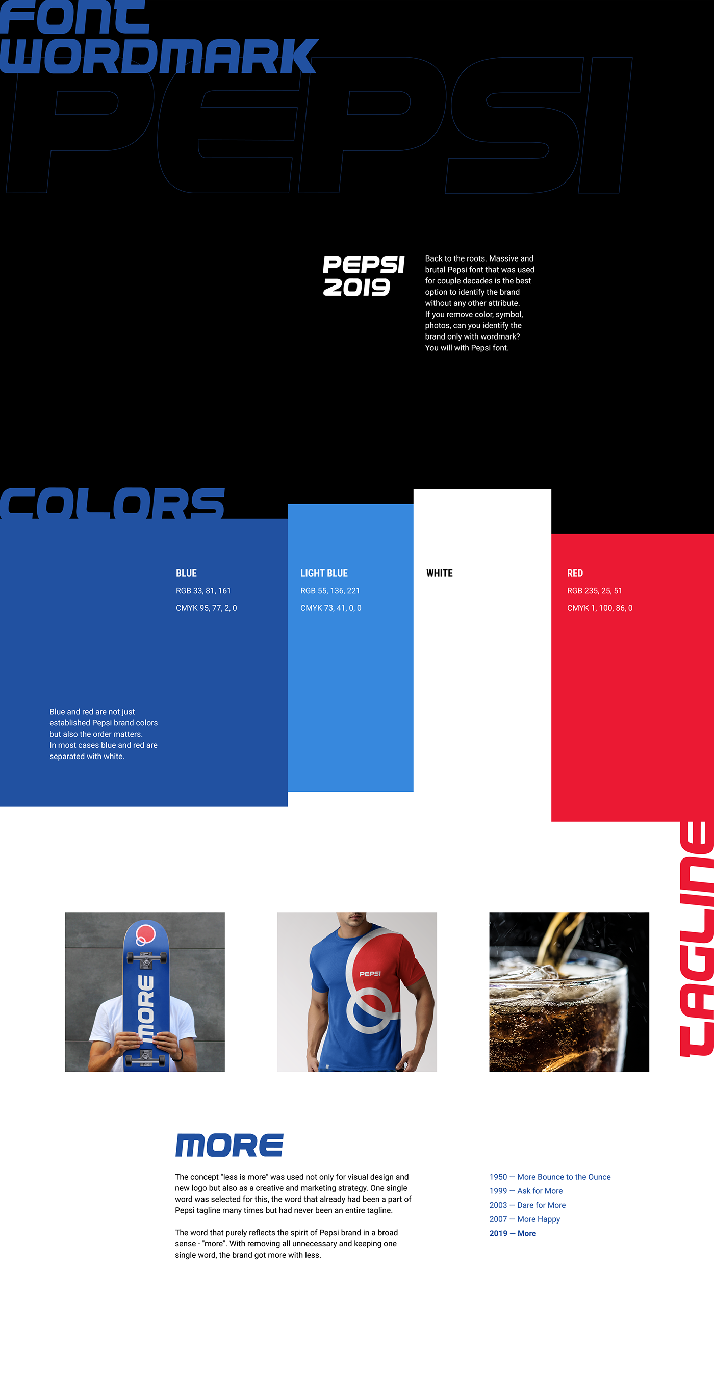
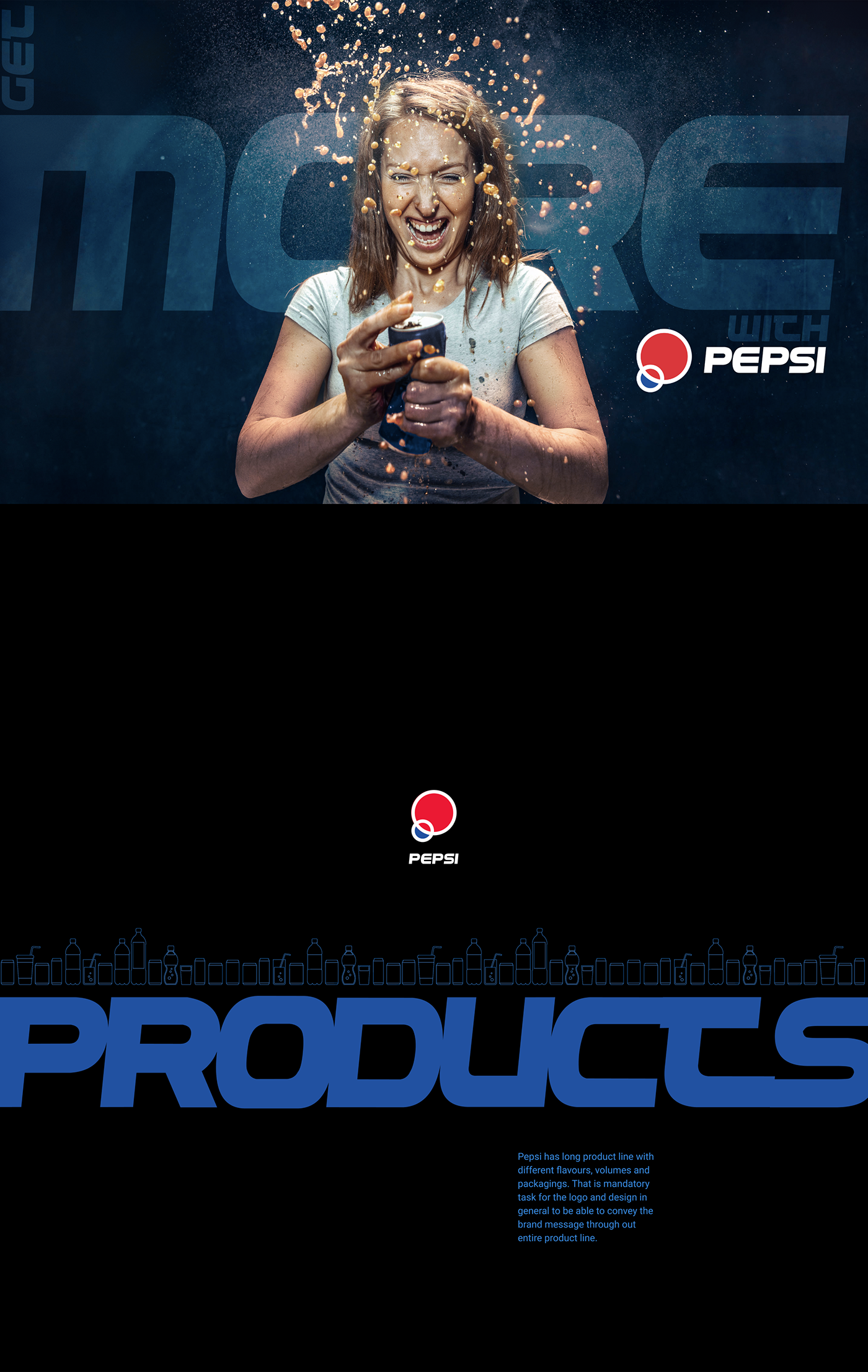
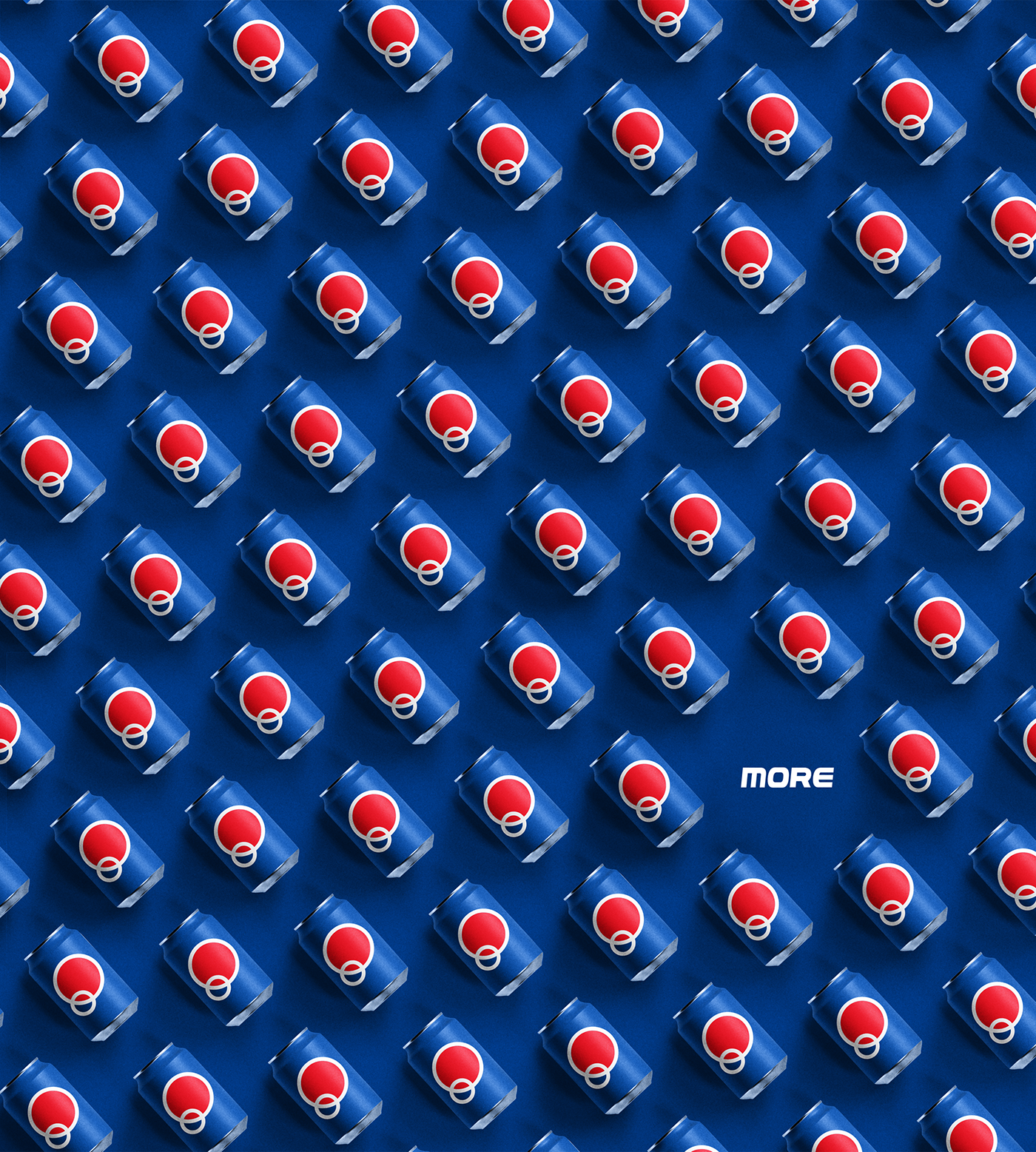
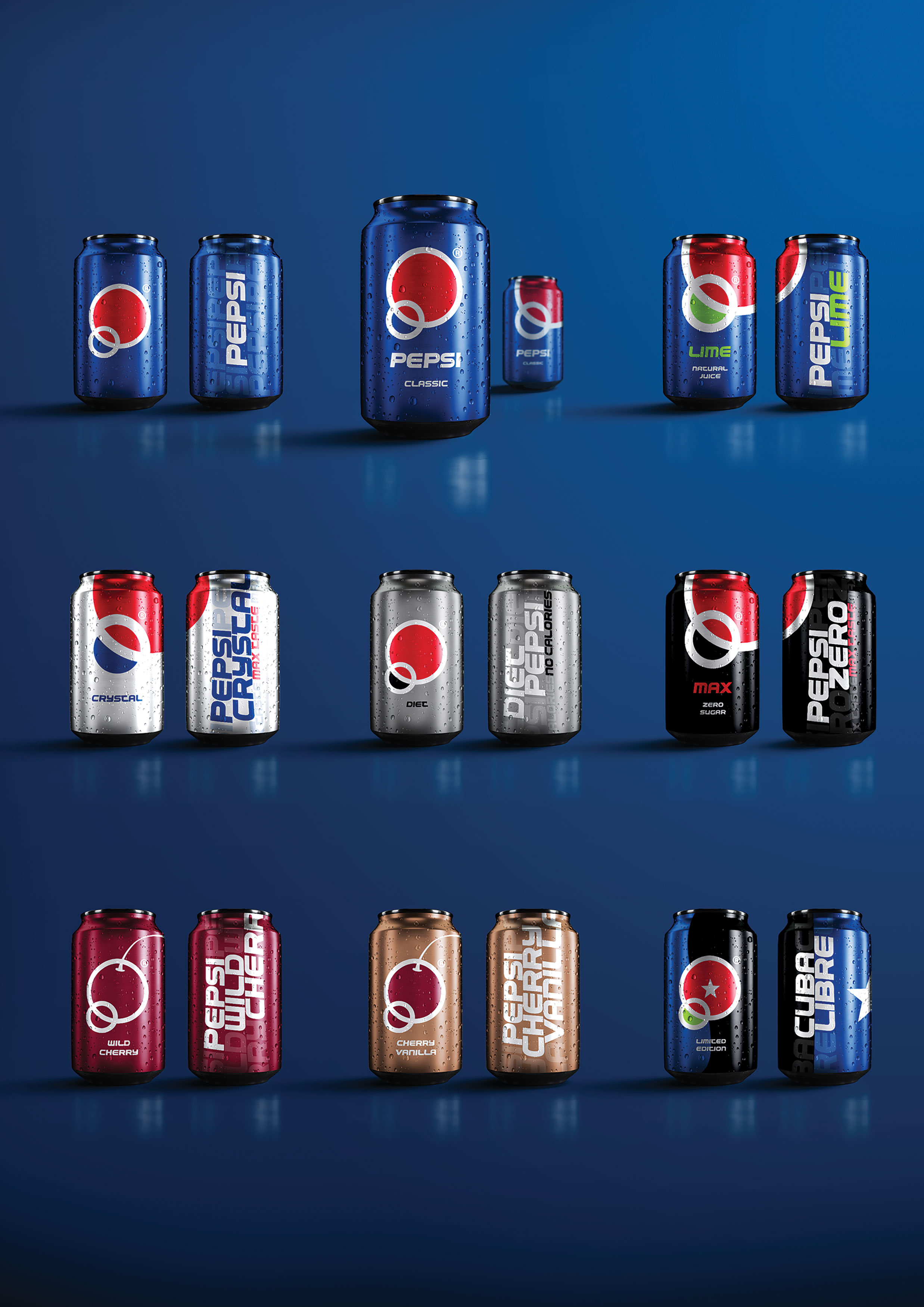
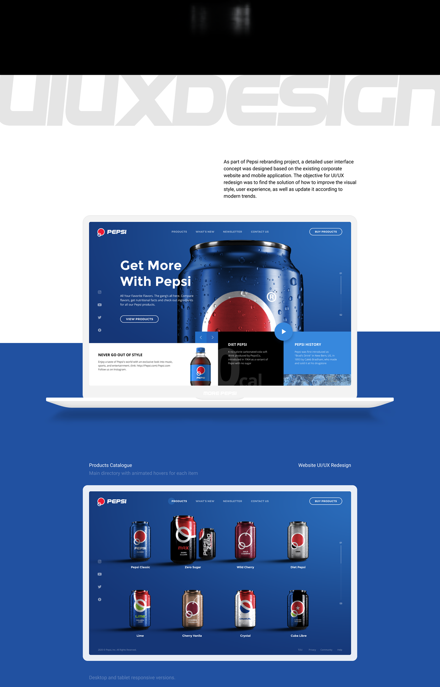
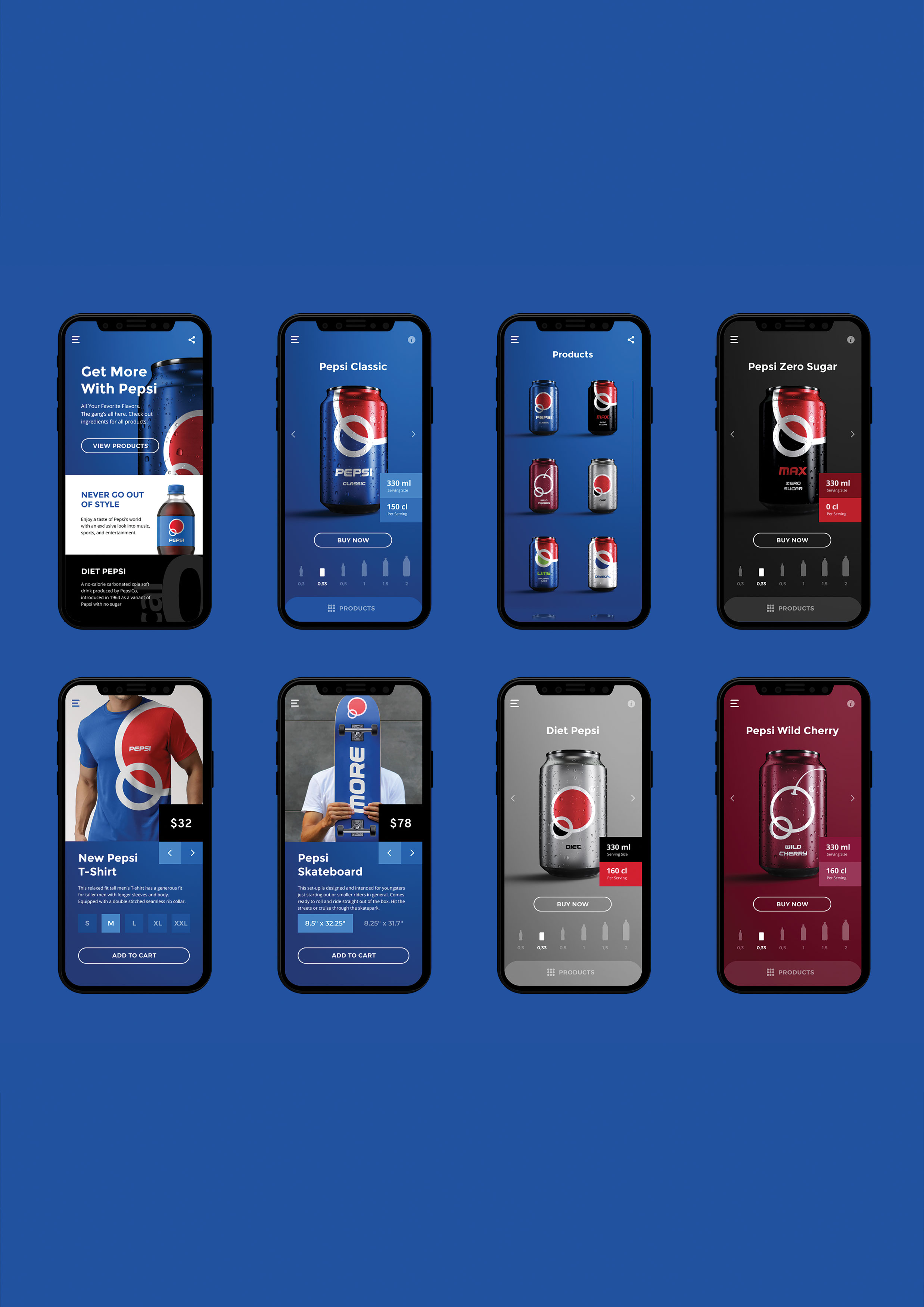
Pepsi Brand·
品牌新标识·
百事可乐·
包装
31赞|10评论|4035人气|43收藏|2020-10-24 02:05:12
关注
私信


 沪公网安备 31011502009179号
挺好看的
太厉害了,膜拜!
厉害
够潮 可能会没有之前的经典
图形延展性是真不错。
已经买了,家里的厕所干净了很多,非常愉快的一次购物
我第一眼想到了日本国旗我
窝巢
我觉得很棒!
这两个圆,我竟然无话可说,反正冲这两个圆我不买百事可乐。