

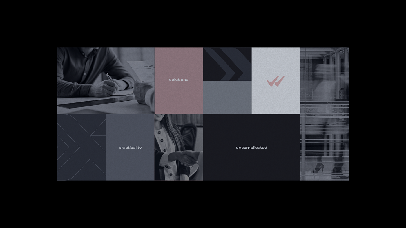
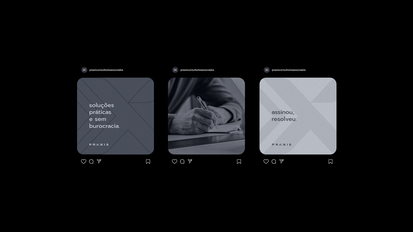
[PT-BR]SobrePRÁXIS é uma empresa de consultoria que também oferece prestação de serviços como: registro de marcas e patentes, análise de contratos, abertura e fechamento de empresas, baixas, alterações, PPRA, segurança do trabalho, consultoria e treinamentos, recuperação de créditos tributários, planejamentos, dentre outros.[EN]AboutPRÁXIS is a consulting company that also offers services such as: registration of trademarks and patents, analysis of contracts, opening and closing of companies, write-offs, alterations, PPRA, work safety, consulting and training, recovery of tax credits, planning , among others.
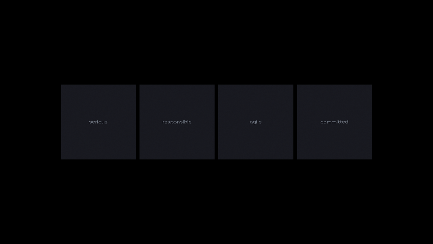
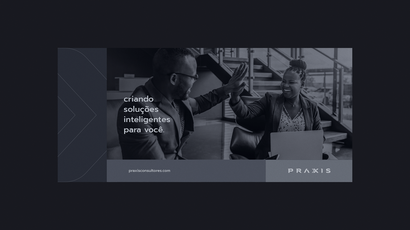
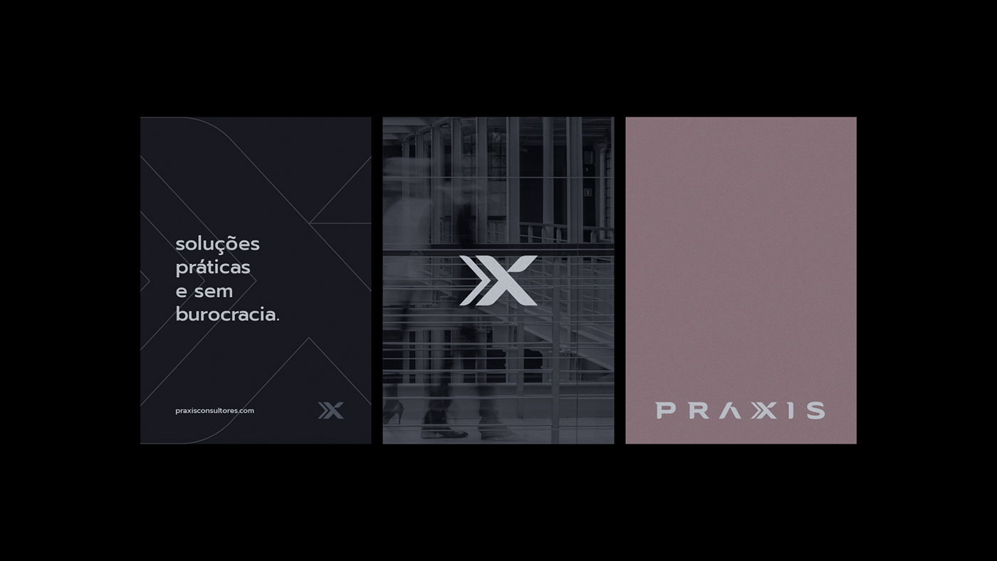
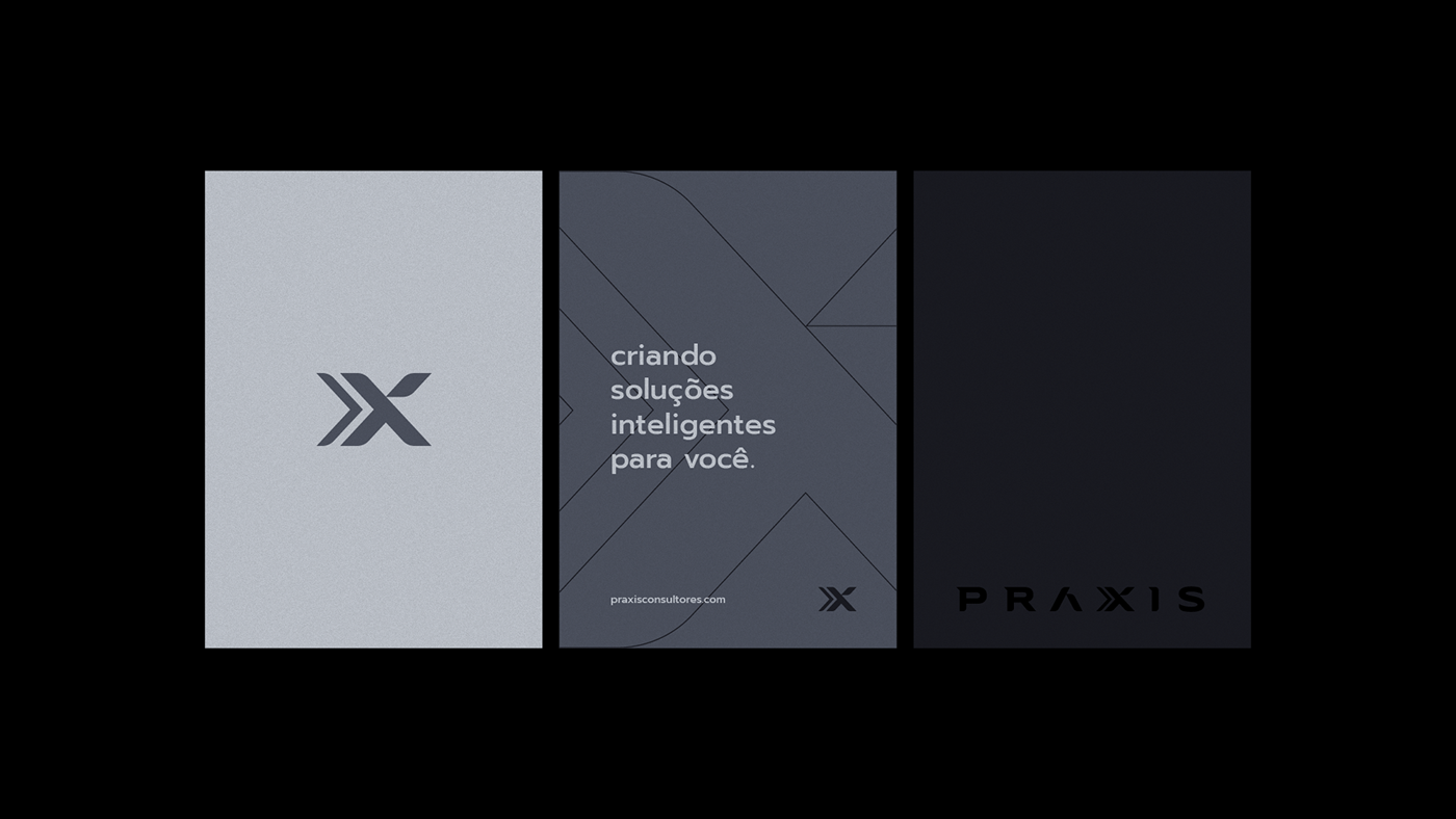
[PT-BR]ConceitoBaseado nos pilares da marca, que são: seriedade, compromisso, responsabilidade e agilidade, buscou-se para a criação do logo e identidade visual que pudesse traduzir a essência da empresa e seus principais serviços/objetivos.Como o principal objetivo da PRÁXIS é solucionar problemas com eficiência e rapidez, dentro das possibilidades reais de cada caso, sem burocracia, era essencial conter na identidade como um todo, a clareza desse objetivo, ou seja, transformar esse conceito em um visual palpável. Sabendo disso, foi escolhido utilizar no projeto em questão um logo formado pelo nome, com fontes estilizadas, únicas e exclusivas, que buscam transmitir a mensagem de que: para problemas simples e complexos, a solução sempre busca simplificar, tornar mais fácil, transformar para melhor, assim como a PRÁXIS.[EN]ConceptBased on the pillars of the brand, which are: seriousness, commitment, responsibility and agility, we sought to create a logo and visual identity that could translate the essence of the company and its main services/objectives.As the main objective of PRÁXIS is to solve problems efficiently and quickly, within the real possibilities of each case, without bureaucracy, it was essential to contain in the identity, as a whole, the clarity of this objective, that is, to transform this concept into a tangible visual.Knowing this, it was chosen to use in the project in question a logo formed by the name, with stylized, unique and exclusive fonts, which seek to convey the message that: for simple and complex problems, the solution always seeks to simplify, make it easier, transform to better, as well as PRAXIS.
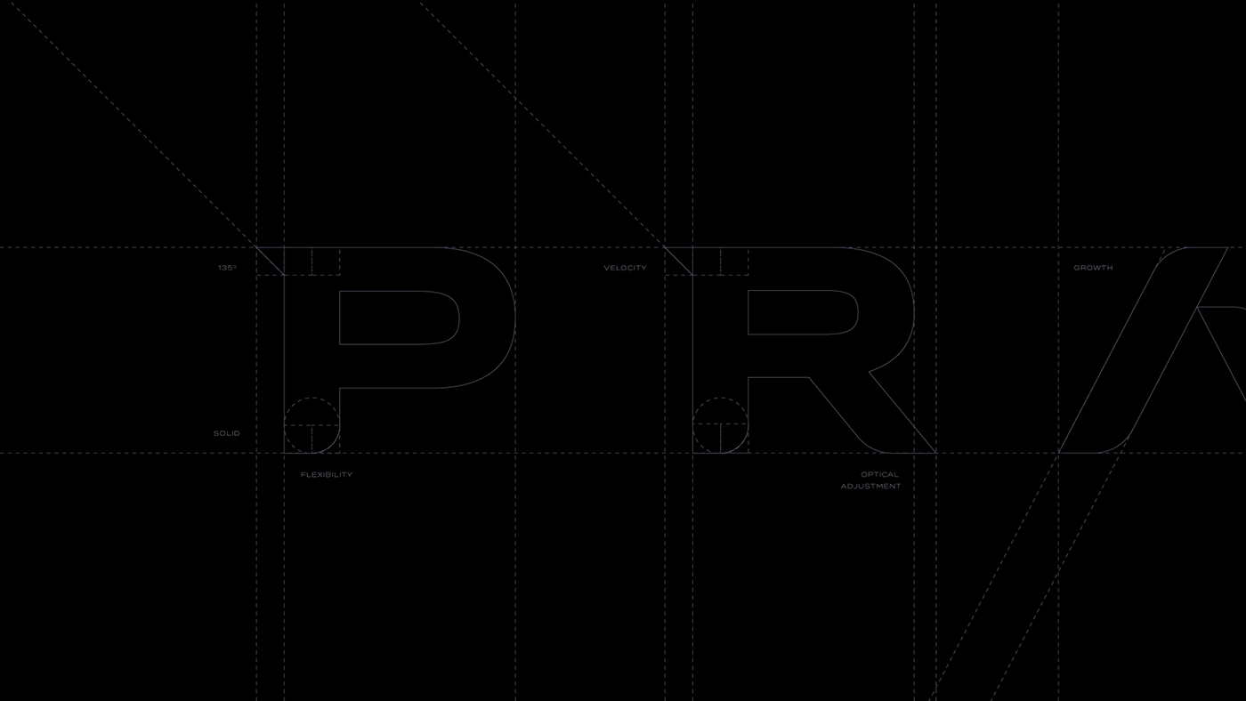
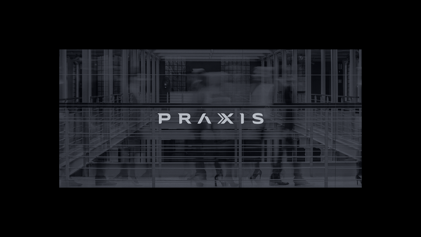
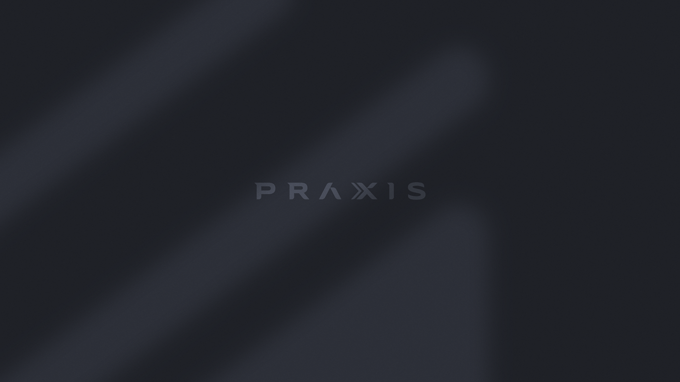
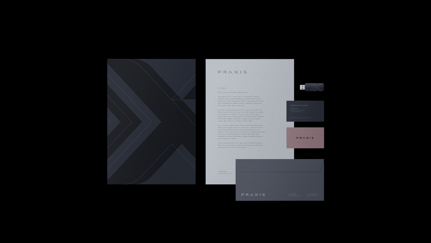
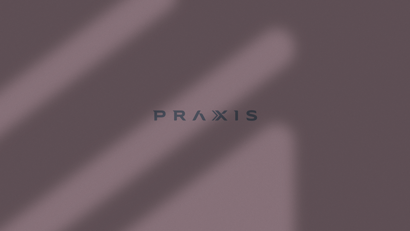
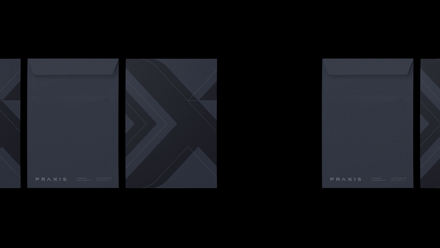
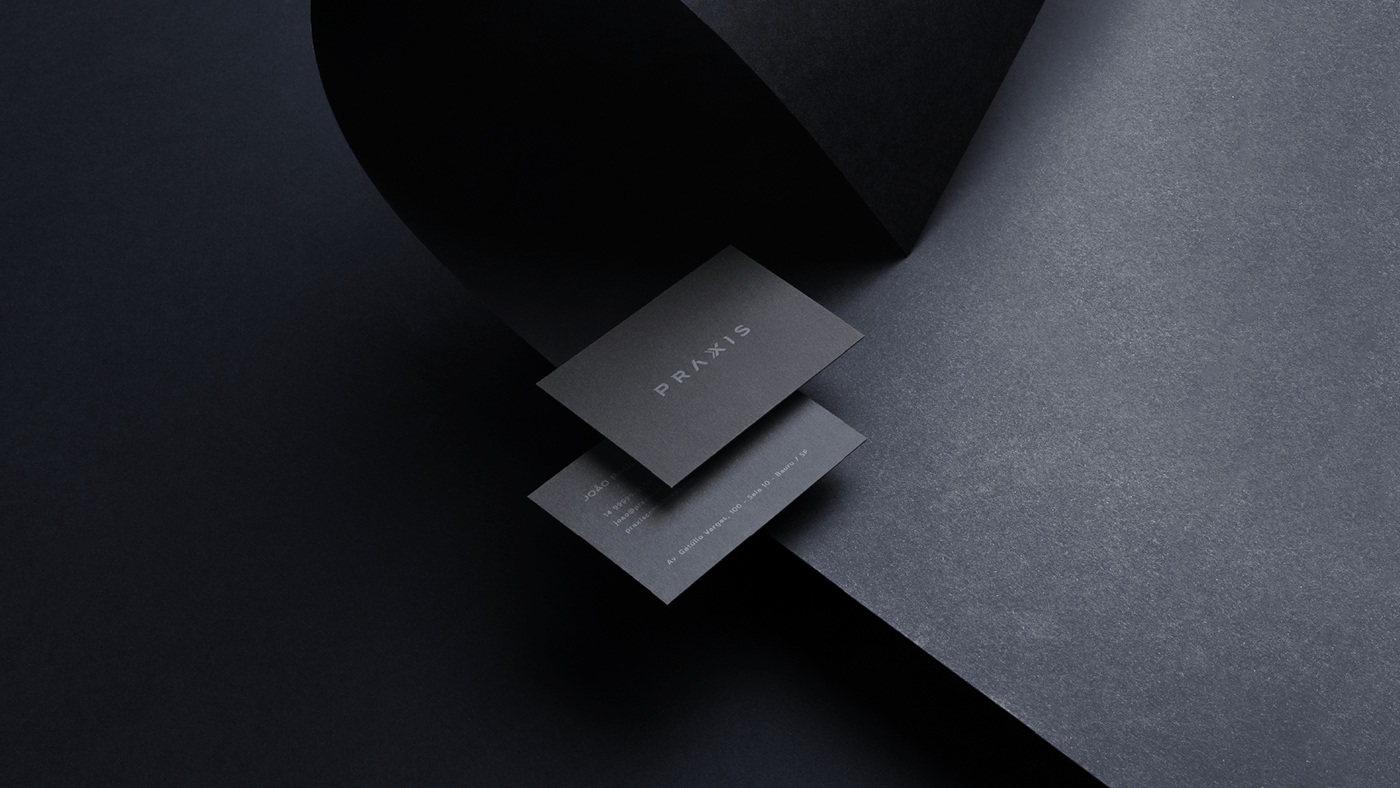
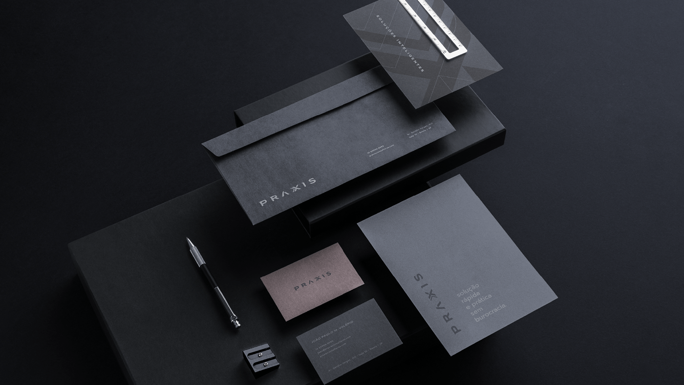
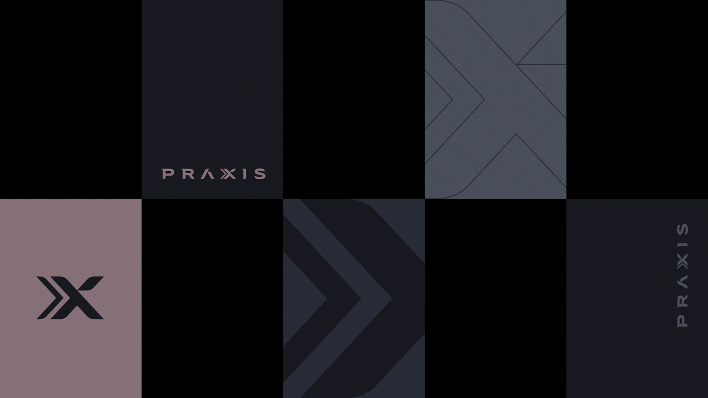
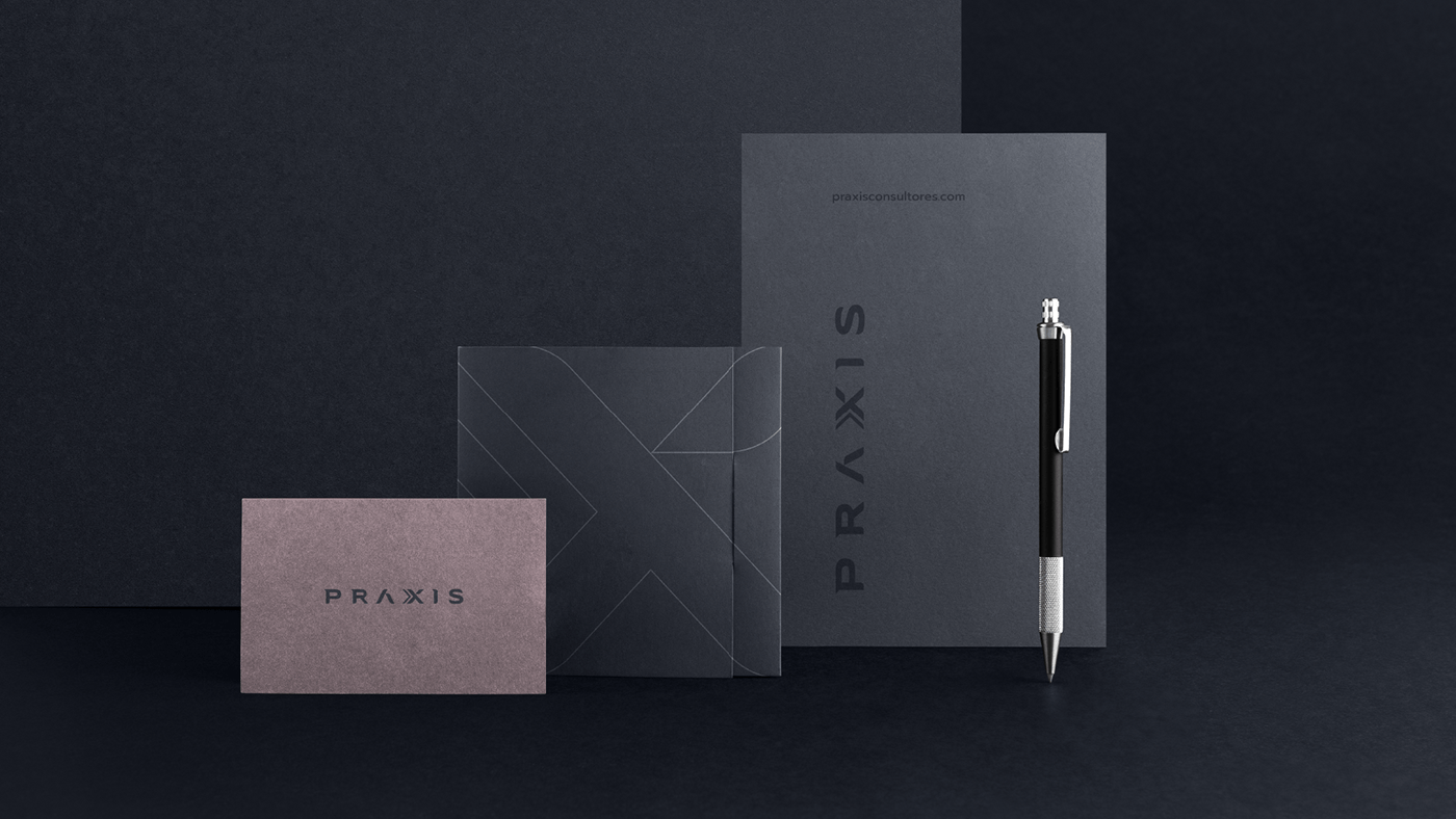
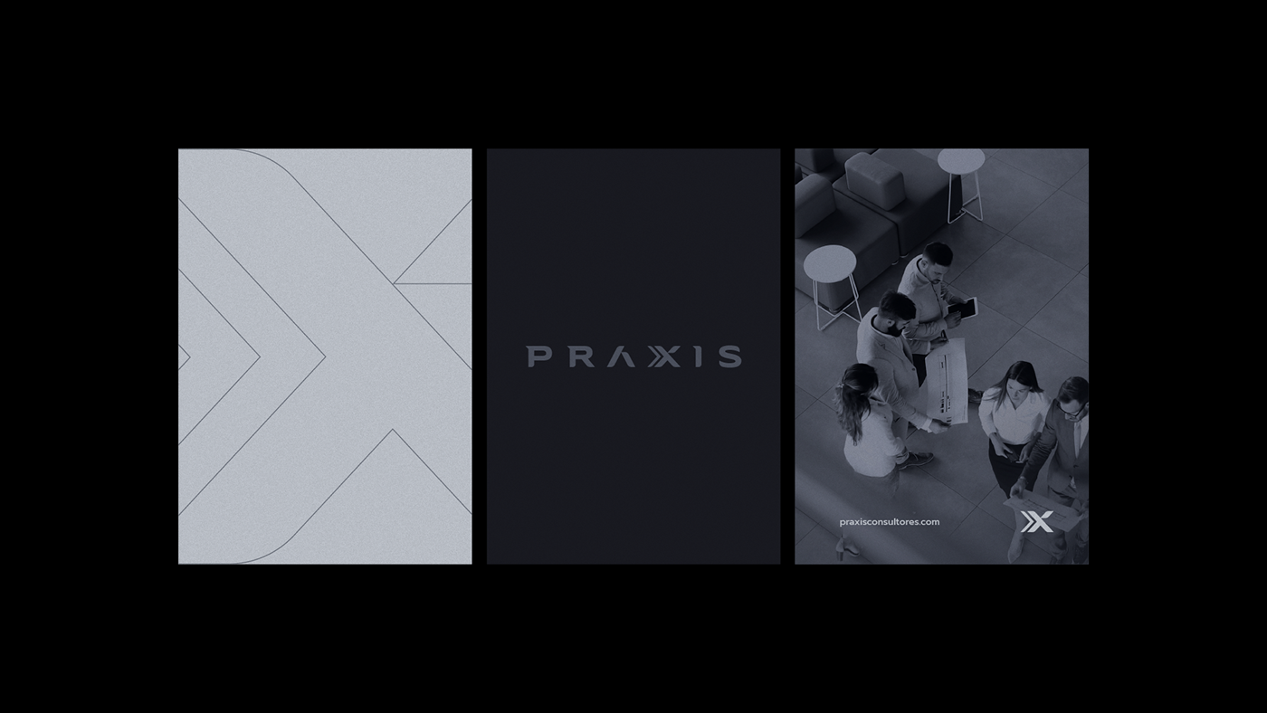
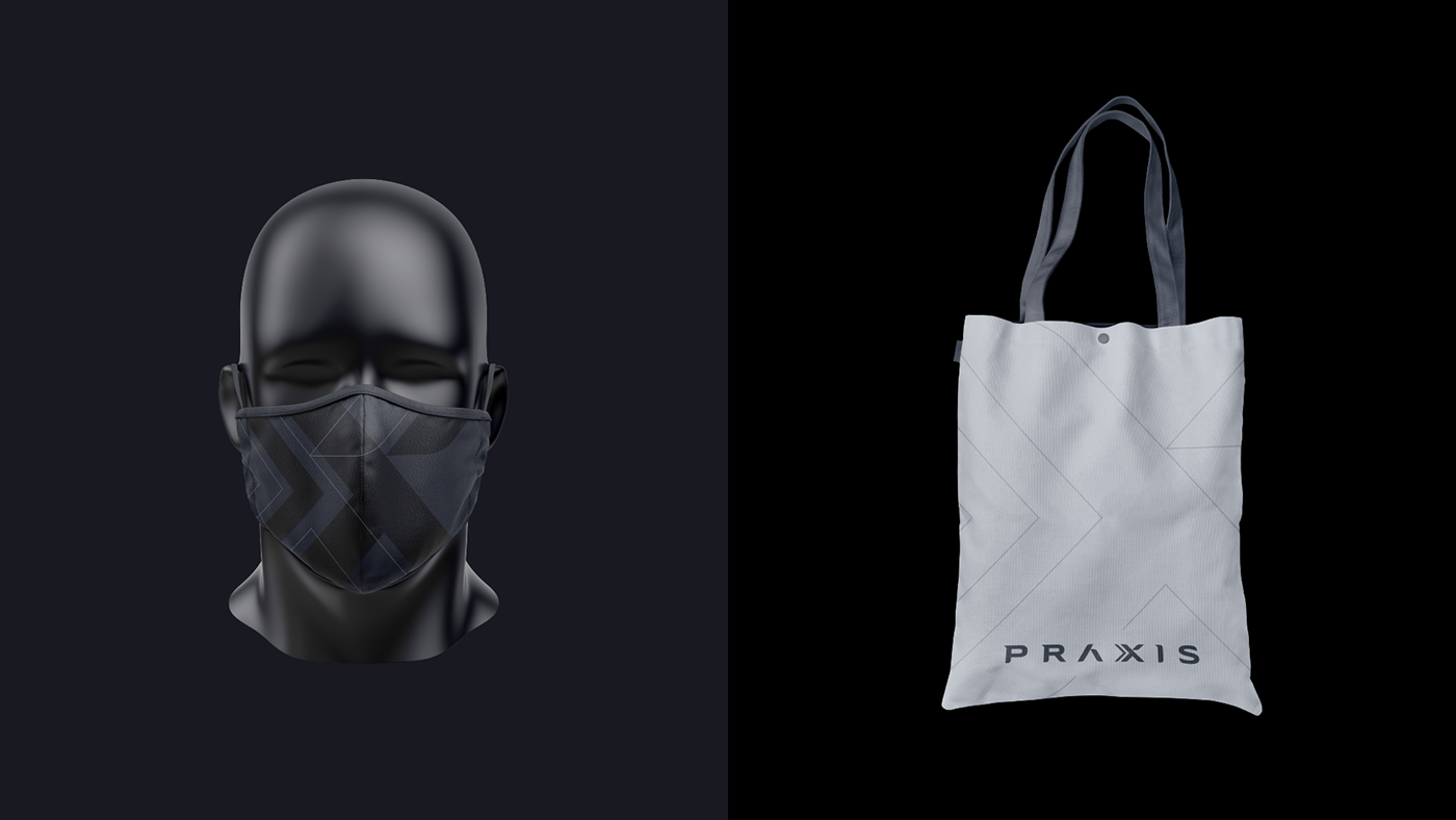
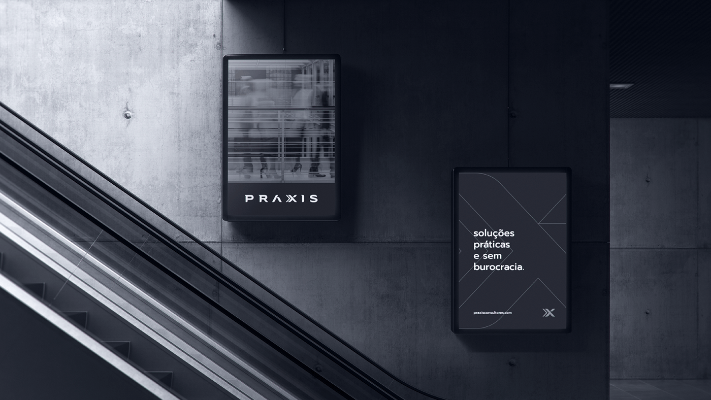
[PT-BR]LogoPartindo da ideia de que a marca deveria traduzir todos esses conceitos, o logo criado é formado por fontes bastonadas, firmes e muito bem espaçadas. Há serifas em algumas das letras que compõem o logo, que dão sensação de velocidade, característica importante no que diz respeito aos serviços oferecidos pela PRÁXIS. A estilização da fonte é feita através de cortes que formam as letras. esse recurso é utilizado para dar a sensação de: firmeza, equilíbrio e sustentação. o resultado visual é moderno e ao mesmo tempo sucinto.[EN]LogoBased on the idea that the brand should translate all these concepts, the logo created is formed by basted, firm and very well-spaced fonts. There are serifs in some of the letters that make up the logo, which give a sense of speed, an important feature with regard to the services offered by PRÁXIS.The font styling is done through cuts that form the letters. this feature is used to give the feeling of: firmness, balance and support. the visual result is modern and at the same time succinct.

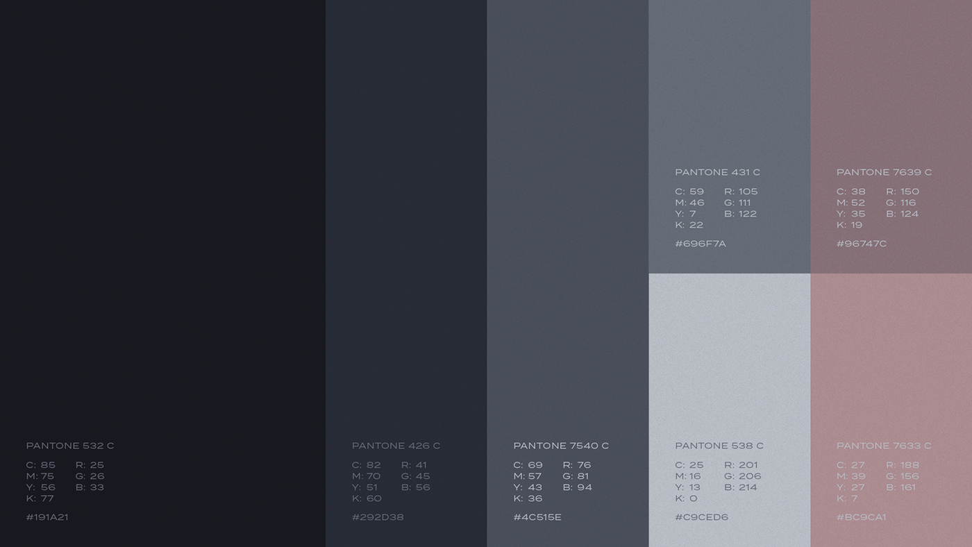
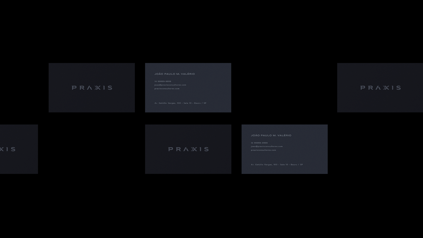
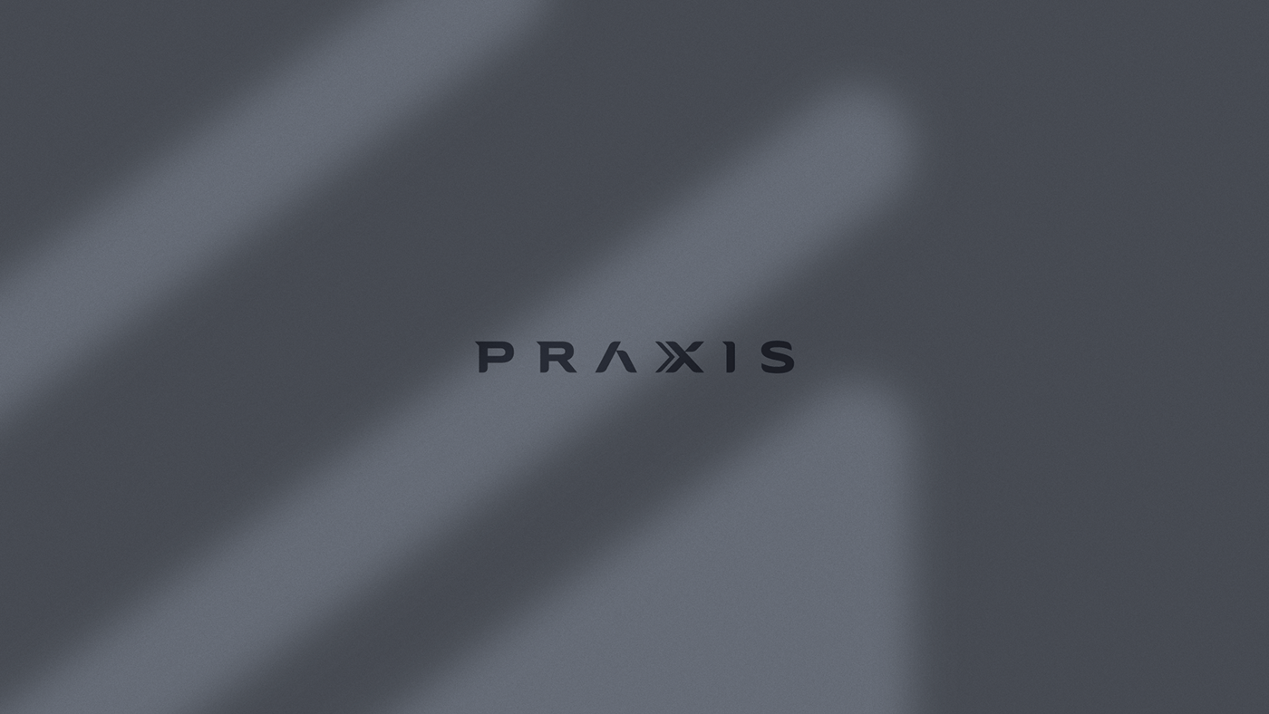
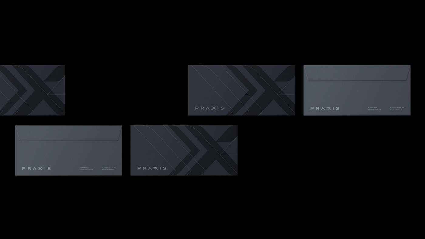
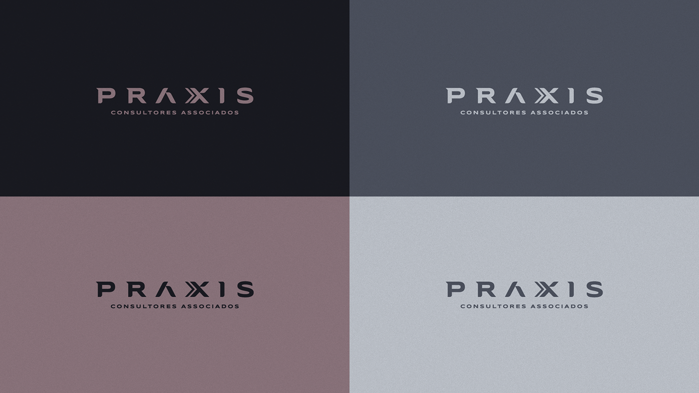
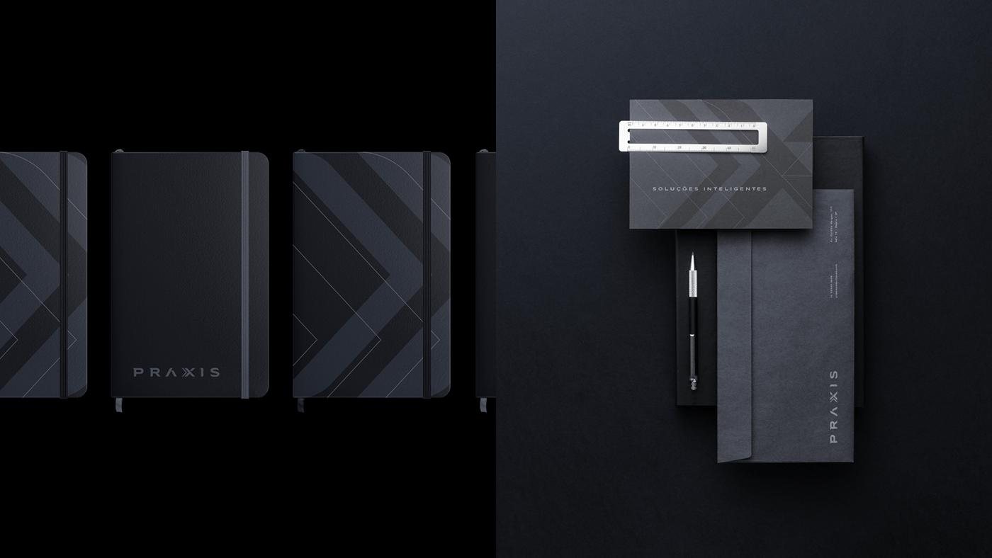
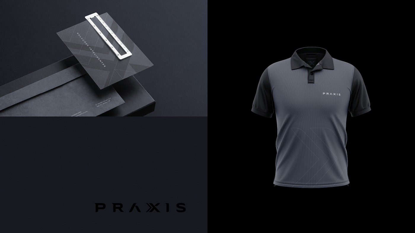
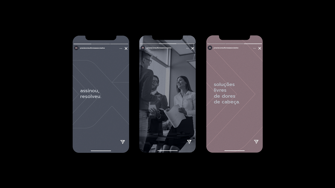
[PT-BR]Cores, Tipografia e Identidade VisualAs cores da identidade visual foram escolhidas baseando-se nas preferências dos clientes, que solicitaram por cores sóbrias, não vibrantes, para trazer seriedade ao projeto. O destaque fica por conta dos tons de ouro rosê, que dá um contraponto elegantíssimo com os pretos e cinzas azulados da paleta de cores.A identidade visual como um todo dá vários caminhos a serem seguidos, pois ela possibilita que a marca possa se comportar de forma extremamente séria e sofisticada quando necessário, e também de forma mais despojada e moderna quando possível.O resultado é um logo e identidade visual assertivos, que se complementam e individualizam a marca perante à concorrência.[EN]Colors, Typography and Visual IdentityThe colors of the visual identity were chosen based on customer preferences, who asked for sober, non-vibrant colors to bring seriousness to the project. The highlight is the rose gold tones, which provide a very elegant counterpoint with the blacks and bluish grays of the color palette.The visual identity as a whole gives several paths to be followed, as it allows the brand to behave in an extremely serious and sophisticated way when necessary, and also in a more laid-back and modern way when possible.The result is an assertive logo and visual identity, which complement and individualize the brand against the competition.


INSTAGRAM | DRIBBBLE | PINTEREST

设计师还没有其他作品哦
 关注
点赞
收藏
关闭弹幕
留言
关注
点赞
收藏
关闭弹幕
留言
确认要删除该条评论吗?
小小心意,大大鼓励
最高赞赏200元
使用支付宝扫描二维码完成支付
使用微信扫描二维码完成支付
当前余额:¥0.00
支付操作会向你普象账户的注册手机号发送验证码
请注意查收

扫一扫添加
普象商务
扫一扫添加
客服微信

扫一扫下载
手机APP

请关注公众号iamdesign或扫码关注
 沪公网安备 31011502009179号
沪ICP备13011487号-2 上海普象文化传播有限公司
沪公网安备 31011502009179号
沪ICP备13011487号-2 上海普象文化传播有限公司
留言板(0)